Last time I did the Tapirulan brief I took it down quite an abstract and conceptual road so it didn't bear much obvious visual resemblance to the theme. This year we have been given a bit more time on the brief and encouraged to actually enter the competition so I decided just to go with something a bit more commercially viable and not try to twist the theme so much. Having looked at the website most of the previous winners have followed a similar approach and favoured drawing and printmaking over other media so whilst not wanting to be a sheep I think I might as well give that kind of approach a go and attempt something that's more likely to be successful.
SOS is quite a difficult theme to interpret in an original way. I started off by thinking about the obvious nautical connection and also about the quite cliched idea of SOS spelled out in the sand so it can be seen from above. This led me on to thinking about more subtle ways to spell it out and how that could be done by accident.
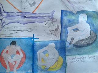
I thought about the "dot dot dot dash dash dash dot dot dot" morse code pattern and the idea of people floating in lilos and rubber rings unintentionally signalling to be rescued. As a bit of a habitual non-drawer I had a lot of trouble at first (hence why I've cropped the pictures of the sketchbook pages) but eventually I got into it and decided on a style I liked:
Another idea I had was about signs overlapping and spelling out SOS which obviously has less of a narrative but visually could be quite nice. I did a bit of lino and monoprinting for this which I thought was pretty effective and always an easy and fun way to fill up a sketchbook.
Another idea I had was about bulbs failing on a typographic sign changing the meaning of the sign, for example "storage" could become "rage" if the S, T and O went out. I liked the idea of spelling out SOS on some dingy roadside shop/diner/bar/petrol station type place so I played about with a few compositions and media:
I really like this idea though it's not been that well executed. I would definitely need to play around with some media and see what works. I like that it's quite sombre in mood although bearing in mind that all the finalists for the competition have their pieces put in a calendar obviously I still want to keep it a bit light hearted.


No comments:
Post a Comment