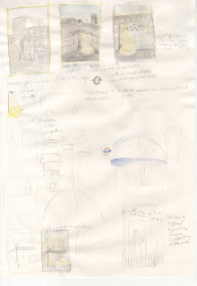
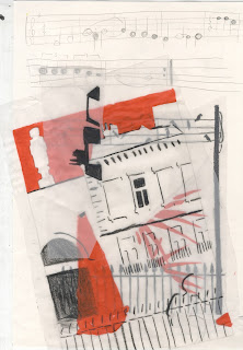
The Association of Illustrators run a yearly competition in partnership with the London Transport Museum to produce an illustration for display in an exhibition and this year the theme is "Sounds of the City". I liked the idea of the brief and decided to work on it to ease me in gently before tackling the first of my four main self-generated projects. Thinking about how to visualise sound, I was reminded of a photo I took a couple of weeks ago of birds on wires which reminds me of music notes on a stave.
I thought it could be nice to incorporate this into a street scene and started working on some sketches.
As the exhibition is to be held in London Transport Museum it made sense to incorporate some transport elements into the image and make it a London street scene. I initially wanted to have a bike against a wall in a quiet street but it looked pretty dead and lifeless.
I experimented with a couple of screenprints to try and get some shape to my ideas before referring to photos to get more accuracy to the elements I was including in the image. I looked at a couple of books, and photos I had taken on a trip to London with my family when I was ten which included this belter:
Looking at actual reference images helped me visualise the scene a lot better and I got a layout resolved pretty quickly after that.
I knew I wanted to screenprint my illustration so I drew it out larger before tracing the image in different colour separations using acrylic paint and china marker.
I also decided to make the music notes from a song about London and chanced upon The Byrds' Eight Miles High which seems apt. I like that the song is quite melancholy and about disappointment in the big city which is an interesting hidden message.
The screenprint was pretty complicated to produce at seven layers but I think it was worth the effort. I got the colour of the sky by using an ink blend and I think the textures and layering of inks is pretty effective. Adding figures to the scene added more life and I like that there are lots of different levels from the buildings in the background to the leaves and fence in the foreground. I also incorporated the Transport for London logo into the pool of light from the lamppost having seen previous winners of the competition using similar tricks.
I tried out a few different colour combinations, some more effective than others, but from the start I knew my favourite would be this one, which is what I ended up submitting:


