Saturday 6 December 2014

Summer Project

The brief for my summer project this year was called "Library and the Book" and was about the process of visiting a library and choosing a book, with the final outcome to be an A3 poster. I started by taking some photos and doing some sketchbook work about the journey to my local library.


It was nice to do some exploring of my local area. When I got the library I had a look around and was drawn to the Urdu section because I like look of the writing. I had a look through the books and was drawn to the ones with cheap looking covers and eventually chose a trashy looking thriller. 


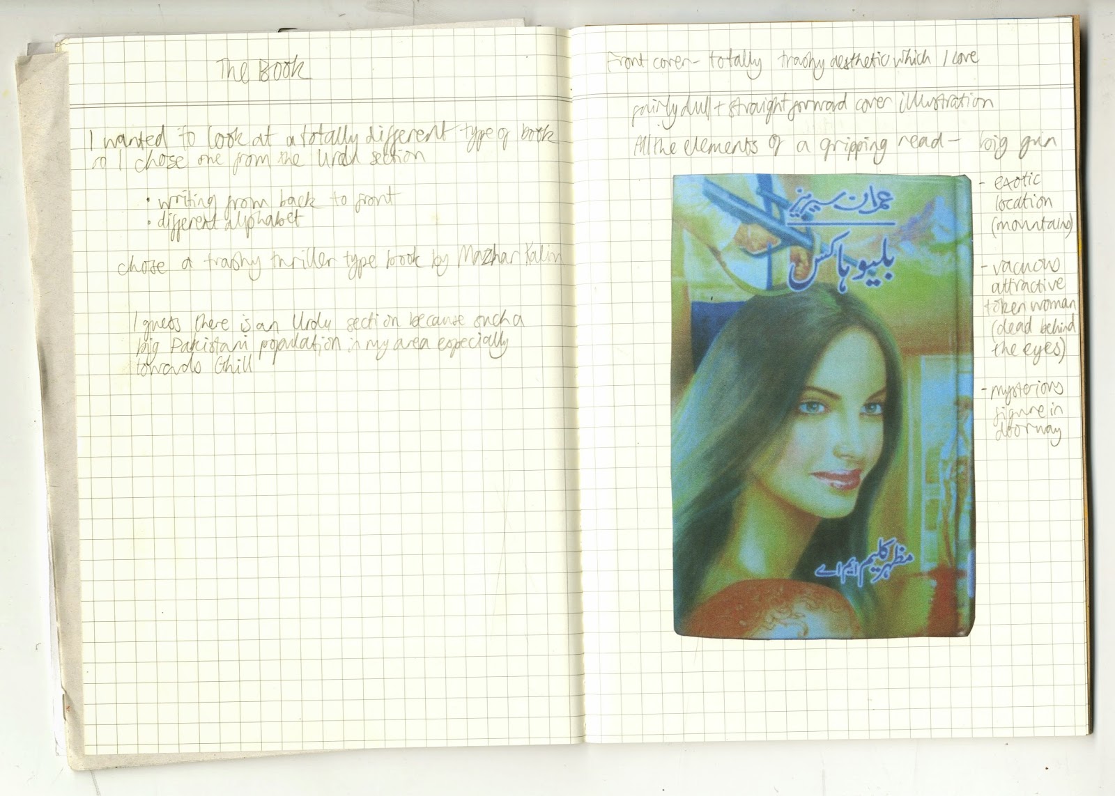
As it was in Urdu I couldn't understand the content so just focused on its physical qualities and appearance. The book read from back to front which was interesting. I liked the fact that it was cheaply and poorly printed and the garish, trashy graphic design.


A couple of the pages were torn and scribbled on with crayon which gave some clues about the people that had read it before. I decided to use crayon to make my final poster. I found it interesting how the image of the woman was a central part of the cover design, but I felt that she wasn't a central or well developed character, more of a sex object or motive for the other characters. For my final poster I drew a background of mountains inspired by the mountains on the cover of the book. I drew a portrait of a woman in blue referencing the author photo on the back cover, incorporated text, and finally scribbled over her face to partially obscure her. I guess the poster is kind of meant to show my frustration at the lack of convincing/important female characters.

Dreamscape Book

My longest brief this year has been to produce an artists book on the theme of "scape". I started with some research, taking photos of the landscape and the cityscape.


Next I did some sketchbook work on the theme of dreamscape, trying to work out how I wanted my book to look. I had an idea about trying to make dreams visual/real and spent lots of time in the darkroom trying to make "photos" of dreams using painted acetate as a negative and experimenting with photograms. 


I got some interesting effects but I didn't really feel that it was working so I went back to the black and white photos I took at Tentsmuir Beach.


I liked these photos and the ambiguity of what the building was - it gave a feeling of the surreal which tied in with my dream theme. I experimented with overlaying feathers onto the photo paper before exposing them which gave an interesting ghostly effect.


Eventually I developed an idea and made the finished book using photos I developed and cellulose transfers. I decided to make the content of the book quite ambiguous, tying in the idea of Native American dreamcatchers and the process of film photography. Here's the result.


Tuesday 11 November 2014

X Project Prints


Finally finished my one week "X" project from the start of semester. I screen-printed some images from my sketchbook to try and make some more resolved pieces, and clipped them all together to make a book, which gave it a nice informal layered feel.


I really enjoyed the screen-printing process and the subtle but vibrant results I got from it. For my final piece I just layered several images and gave it the title "Into the Unknown" to tie in with my theme.

Tuesday 21 October 2014

X Project

Finally back at art school for my 2nd year. We were launched in right away with a one week project using the brief from the annual Tapirulan illustration competition. The theme this year was "X". I focussed on the idea of the unknown and that we know more about outer space than we do about the deep sea, which appealed to me as both fascinate me.

I started thinking about the similarities between the deep sea and outer space and the humans that explore them - both are inhospitable, alien environments, humans are buoyant in these settings, and deep sea divers and astronauts are somewhat similar aesthetically as well as in terms of what they do. I started playing around with pictures of divers from a book I have and making them look like they were in space through painting and collage.


I found a picture in an old encyclopaedia which I found interesting, it was a diagram of Ptolemy's geocentric model of the universe. I thought that tied in nicely with the unknown, as it made me reflect on advances in our knowledge, and also the fact that in several hundred years our theories for the universe may look outdated and ridiculous too. I also liked the concentric circle design and decided to include it in some collages.


I liked the concentric circles and how they tied in with motion capture photos of stars, shoals of fish and so on. I toyed with the idea of coral looking like planets/moons and the holes looking like craters.


I continued to make collages in this vein. I particularly like the one below right, with the bell jar as a metaphor for the universe and the diver as a metaphor for "God".


I briefly digressed into the bell jar idea, and also into the idea of the Bermuda triangle which wasn't so successful. The timescale of this project was definitely a struggle for me as it was difficult to resolve such a short project.


Next week I'm going to try screen-printing some of the images I made and hopefully bring the project to a close.