Saturday, 6 December 2014

Dreamscape Book

My longest brief this year has been to produce an artists book on the theme of "scape". I started with some research, taking photos of the landscape and the cityscape.


Next I did some sketchbook work on the theme of dreamscape, trying to work out how I wanted my book to look. I had an idea about trying to make dreams visual/real and spent lots of time in the darkroom trying to make "photos" of dreams using painted acetate as a negative and experimenting with photograms. 
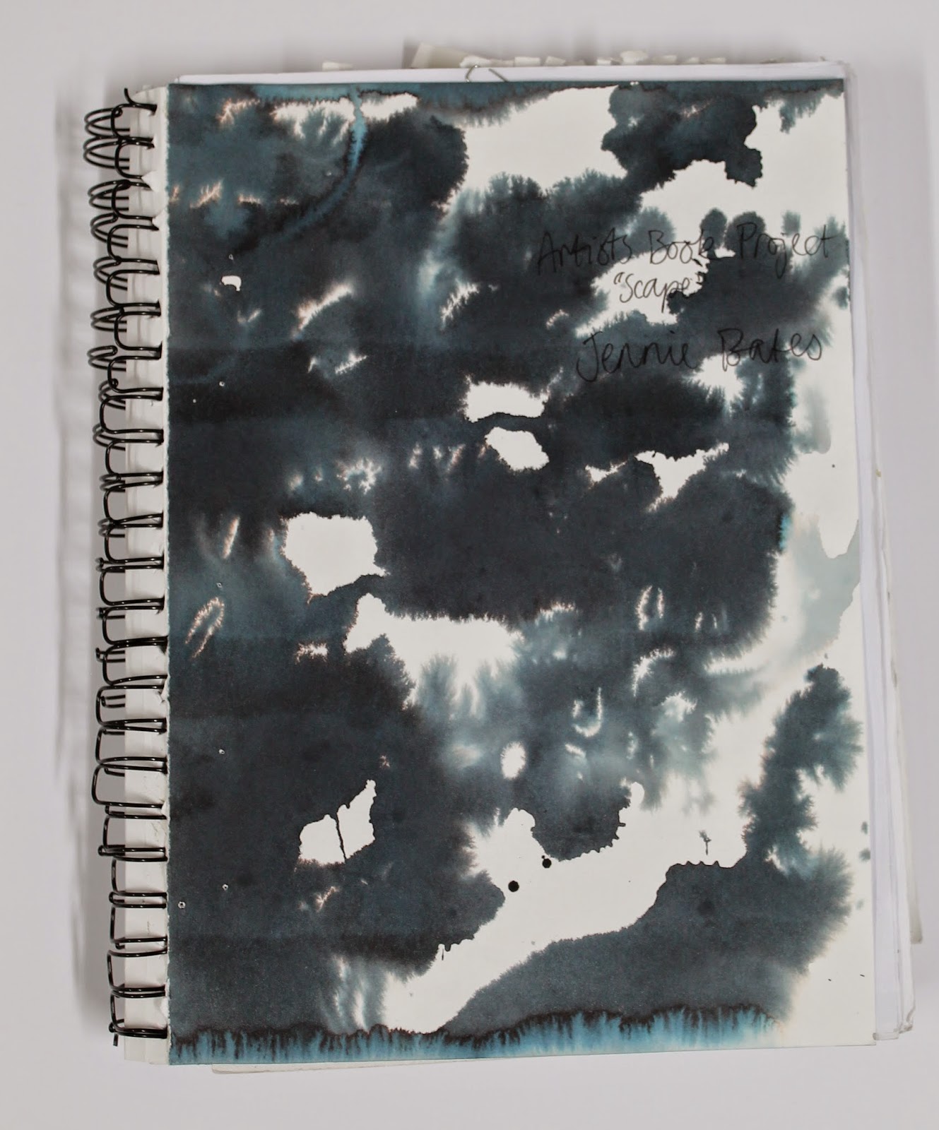


I got some interesting effects but I didn't really feel that it was working so I went back to the black and white photos I took at Tentsmuir Beach.


I liked these photos and the ambiguity of what the building was - it gave a feeling of the surreal which tied in with my dream theme. I experimented with overlaying feathers onto the photo paper before exposing them which gave an interesting ghostly effect.


Eventually I developed an idea and made the finished book using photos I developed and cellulose transfers. I decided to make the content of the book quite ambiguous, tying in the idea of Native American dreamcatchers and the process of film photography. Here's the result.


Tuesday, 11 November 2014

X Project Prints


Finally finished my one week "X" project from the start of semester. I screen-printed some images from my sketchbook to try and make some more resolved pieces, and clipped them all together to make a book, which gave it a nice informal layered feel.


I really enjoyed the screen-printing process and the subtle but vibrant results I got from it. For my final piece I just layered several images and gave it the title "Into the Unknown" to tie in with my theme.

Tuesday, 21 October 2014

X Project

Finally back at art school for my 2nd year. We were launched in right away with a one week project using the brief from the annual Tapirulan illustration competition. The theme this year was "X". I focussed on the idea of the unknown and that we know more about outer space than we do about the deep sea, which appealed to me as both fascinate me.

I started thinking about the similarities between the deep sea and outer space and the humans that explore them - both are inhospitable, alien environments, humans are buoyant in these settings, and deep sea divers and astronauts are somewhat similar aesthetically as well as in terms of what they do. I started playing around with pictures of divers from a book I have and making them look like they were in space through painting and collage.


I found a picture in an old encyclopaedia which I found interesting, it was a diagram of Ptolemy's geocentric model of the universe. I thought that tied in nicely with the unknown, as it made me reflect on advances in our knowledge, and also the fact that in several hundred years our theories for the universe may look outdated and ridiculous too. I also liked the concentric circle design and decided to include it in some collages.


I liked the concentric circles and how they tied in with motion capture photos of stars, shoals of fish and so on. I toyed with the idea of coral looking like planets/moons and the holes looking like craters.


I continued to make collages in this vein. I particularly like the one below right, with the bell jar as a metaphor for the universe and the diver as a metaphor for "God".


I briefly digressed into the bell jar idea, and also into the idea of the Bermuda triangle which wasn't so successful. The timescale of this project was definitely a struggle for me as it was difficult to resolve such a short project.


Next week I'm going to try screen-printing some of the images I made and hopefully bring the project to a close.

Tuesday, 12 August 2014

Generation x Urban Outfitters Window Display


So I've just finished installing my window display for Urban Outfitters. I was staying in Edinburgh from Monday to Thursday and the unveiling was on Thursday night which went pretty well, it's up til the 28th of August.


The experience was amazing - it was so unlike anything else I'd done. It was obviously challenging but such a change for me getting to work on such a large scale. I had been really nervous about the install but it was all surprisingly straight forward - everything ran really smoothly. The outcome itself was exactly as I had planned, with no compromises on the design which was brilliant. I also learned so many different processes and different ways to do things.


The design was based on the locations of the Scottish National Galleries and the idea of all of the artists coming together in these venues. I like the fact that there are several different layers creating a lot of depth to the window. The reflections from the mirrors (which we made from Mylar stretched over wooden frames) are really effective I think - aesthetically, and also just in attracting people's attention to the window - seeing yourself in an installation makes it a bit more interesting.


Having my work shown on Princes Street in Edinburgh during the festival is so exciting! Really pleased with the outcome so I hope everyone else likes it too.

Saturday, 2 August 2014

Sails Project Development

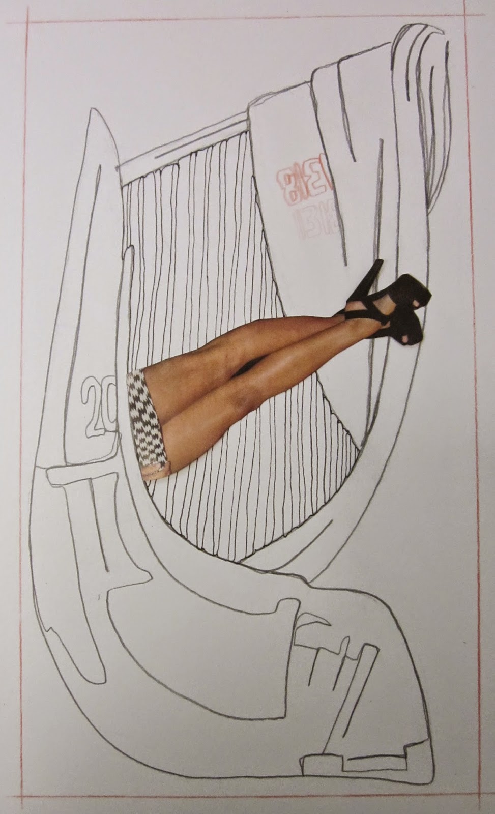
Was looking through work from this year and I found some of the development work from this project. Thought I would share a few images as often the development can be more successful than the outcome.


I like the clean crisp appearance of these line drawings. I spent a lot of time working out composition in this project, so for every individual image I took photos of different possibilities for positioning the legs before committing to sticking them down. 


My development work was often totally bizarre which I think was slightly lost in the planned final outcomes - they didn't have the same feeling of spontaneity and experimental quality.

Memories Project


One of my projects this year was based around the idea of memories. I started by thinking about how memories can change over time, how you can alter memories by retelling them, and how memories of the same event can differ from person to person. I then spent a while sitting about reading the old newspapers which were lying about the studio to avoid having to do any work. After a couple of days of doing absolutely nothing I panicked a bit and started cutting out and playing about with some of the pictures from the newspapers, painting over images or using masking tape to peel them back.


The picture of the boys wearing purple is actually an old school photo which was printed in a newspaper article about institutional sex abuse (pretty topical right now sadly). I started thinking about how all the boys in the photos would have had different memories of their school days, and how the physical "visual memory" or photo, with rows of smiling faces showed a completely different picture than what actually happened. 


One of my tutors suggested I tried a acetone transfer print and showed me how to use the printing press and acetone to take a print from a photocopy. I made A3 copies of some of my sketchbook pages and layered them up in the prints which I think gave a very subtle ambiguous effect which showed exactly what I was thinking about. To complete the images I peeled back a couple of black and white newspaper photos using masking tape and simply stuck them on top which I think grounded the images well. 


Friday, 1 August 2014

Short Film


For the 4 week project at the end of this year at art school, all the communication designers had to choose an audio clip from a selection and make a screen short to accompany it. This was quite a daunting task for me as I tend to work with my hands, only occasionally using my basic computer skills, so the project was quite a learning curve. The clip I chose made me think of state control and dehumanisation - I think the tutors took it from a film but I'm not sure what one - I think if I had chosen a familiar clip it would have been more difficult to come up with an original visual concept. Anyway, I decided to create visuals which compared soldiers to farm animals blindly following orders and not being individual - probably an obvious link but I felt it illustrated what I was getting at pretty well. As usual I used collage for this project, but I think the video format added a new dimension to my usual technique although my computer skills are still a bit lacking.


I had a bit of extra time at the end of the project so I made a few posters parodying the army and navy's promotional slogans "be the best" and "life without limits". To me these slogans are ironic - I don't see how you can be the best when you are constantly being told to do, and I think living and working in these institutions must be extremely limiting.