Showing posts with label screen printing. Show all posts

Thursday, 13 October 2016

Flat Earth News


Devotees of my work will surely remember my seminal Flat Earth installation and accompanying screen-printed book that I made at the end of 2015. Since then ideas about Flat Earth theory have been nagging away in my mind like some kind of well-meaning but irritating acquaintance so I have decided to explore it further and make a more resolved and visually satisfying project.

The main bulk of my work this year is 4 projects - 2 per semester - so they're supposed to be fairly weighty. For my first project of the year I decided to make a newsletter based on the Flat Earth News which the Flat Earth Society published in the 70s-90s, Reading the newsletters I was struck by the ridiculous phrasing and naive graphic design and thought it could be fun to make my own version as a sort of parody.


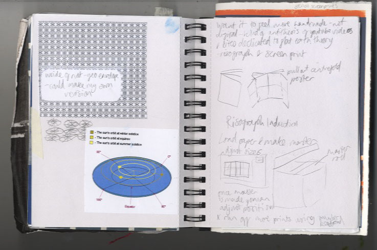

I started doing more research into Flat Earth theory and thinking about various subscription-based and fringe publications. I tried some risographs and stencil screenprints


I was struggling a bit to focus my ideas so decided to make the first edition a "Broader Horizon" issue and started developing some garish visuals and ideas which were quite in keeping with my installation. I was becoming frustrated with it though as I was finding it difficult to make anything that actually looked good, then I had a crit and completely psyched myself out about the whole idea, feeling that it wasn't enough, and veered very off course.
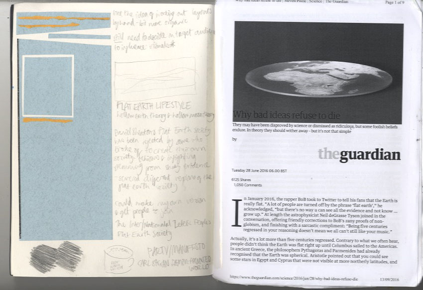

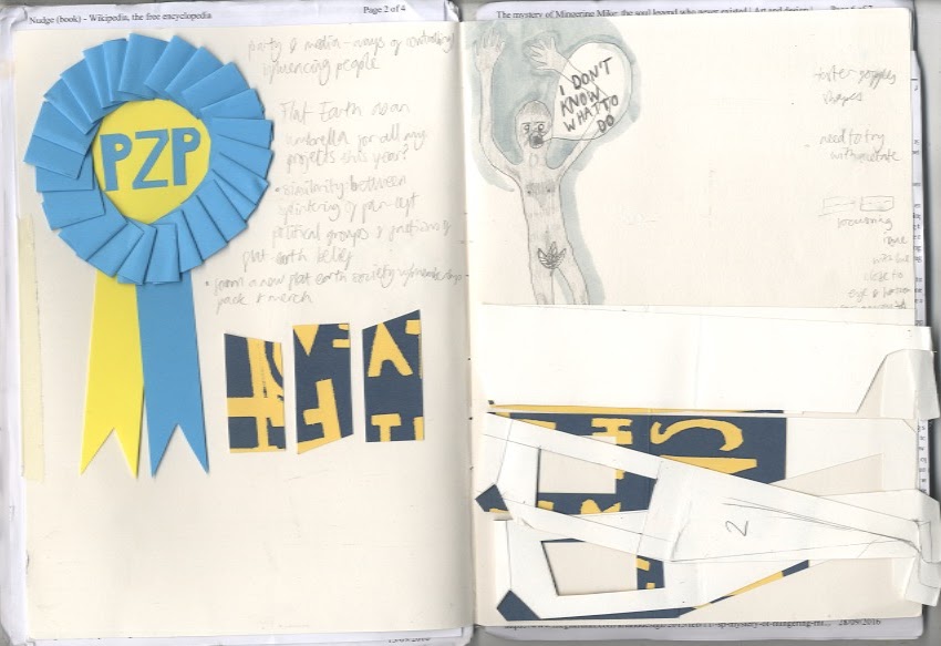
I did loads of research reading some articles and a collection of articles in book form called Lost At Sea by Jon Ronson. In that I read an article about a man who reinvented himself as a soul singer called Mingering Mike and made cardboard records, record sleeves, and recorded tapes spanning an entire fictional career. This got me thinking about outsider art which was interesting, learning about people with an uncontrollable urge to make things without necessarily intending anyone to see them. This made me feel pretty bad considering I had been sitting about for weeks doing virtually hee haw in an attempt to come up with something really original and smart. The more you think about creativity the more it can completely elude you, and the act of making can spark ideas, so I decided to revert back to my artists' block go-to and make some collages.


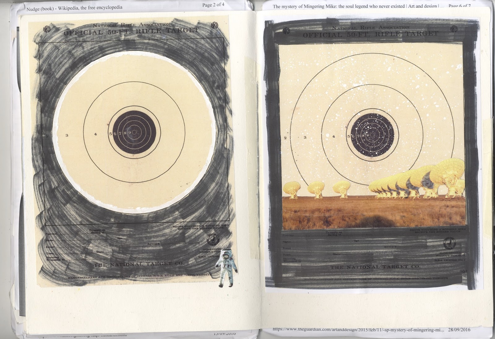
I was thinking about dimensions and flatness and made a collage with paving slabs which I thought was quite effective:


It was the only thing I'd done so far which I found visually rewarding so I got more photos of pavements and started playing about with collage screen-prints:


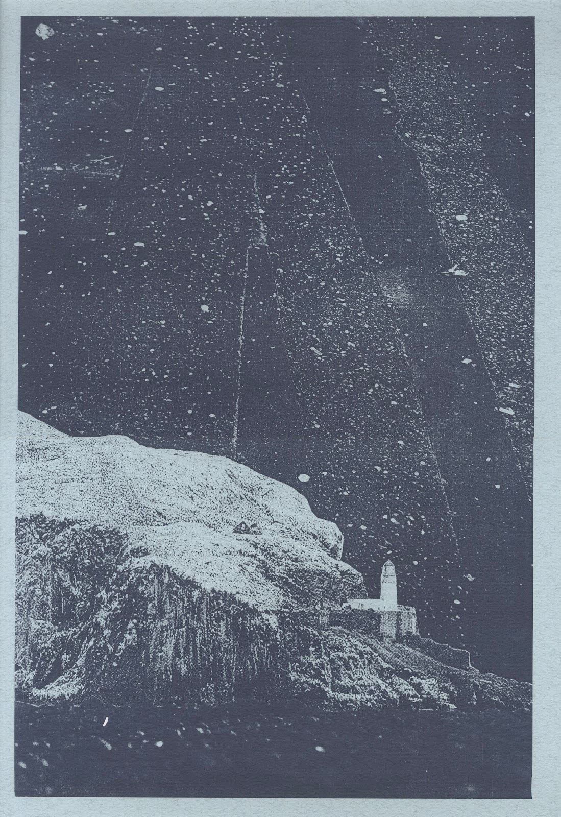


I'm pretty happy with how they look so far - I feel much better about the project now that I actually have something to show for it. Now I just need to work out how to bring together all the separate elements I've been thinking about into a final piece.

Wednesday, 28 September 2016

Sounds of the City

I've had a bit of a blogging hiatus over summer but now I'm a few weeks into my fourth and final (!) year, I finally have something to write about...

The Association of Illustrators run a yearly competition in partnership with the London Transport Museum to produce an illustration for display in an exhibition and this year the theme is "Sounds of the City". I liked the idea of the brief and decided to work on it to ease me in gently before tackling the first of my four main self-generated projects. Thinking about how to visualise sound, I was reminded of a photo I took a couple of weeks ago of birds on wires which reminds me of music notes on a stave.


I thought it could be nice to incorporate this into a street scene and started working on some sketches.


As the exhibition is to be held in London Transport Museum it made sense to incorporate some transport elements into the image and make it a London street scene. I initially wanted to have a bike against a wall in a quiet street but it looked pretty dead and lifeless.


I experimented with a couple of screenprints to try and get some shape to my ideas before referring to photos to get more accuracy to the elements I was including in the image. I looked at a couple of books, and photos I had taken on a trip to London with my family when I was ten which included this belter:

Looking at actual reference images helped me visualise the scene a lot better and I got a layout resolved pretty quickly after that. 


I knew I wanted to screenprint my illustration so I drew it out larger before tracing the image in different colour separations using acrylic paint and china marker.


I also decided to make the music notes from a song about London and chanced upon The Byrds' Eight Miles High which seems apt. I like that the song is quite melancholy and about disappointment in the big city which is an interesting hidden message.


The screenprint was pretty complicated to produce at seven layers but I think it was worth the effort. I got the colour of the sky by using an ink blend and I think the textures and layering of inks is pretty effective. Adding figures to the scene added more life and I like that there are lots of different levels from the buildings in the background to the leaves and fence in the foreground. I also incorporated the Transport for London logo into the pool of light from the lamppost having seen previous winners of the competition using similar tricks. 

I tried out a few different colour combinations, some more effective than others, but from the start I knew my favourite would be this one, which is what I ended up submitting:


Wednesday, 2 March 2016

Growth and Form Prints

For my second self-initiated mini print project I decided to play about with screen printing bolder shapes than usual and using different materials to block the screen. Since last term I've been dipping in and out of D'Arcy Thompson's On Growth and Form, a textbook on mathematical biology which is a surprisingly good read, I promise... Anyway there are some really interesting points of inspiration about design in nature which I picked up on and decided to make some prints relating to structure in leaves so I poached a couple from a bush on campus, sourced a piece of netting from a satsuma box, and played about with some monoprints:


I love the simple almost photographic tonal quality of these prints and decided to incorporate the monoprint method into my final screen prints.