Showing posts with label competition. Show all posts

Tuesday, 15 December 2015

House of Illustration & Folio Society Competition - War Horse Final Outcomes

I just had an induction in waterless lithography which is a print process I immediately took to, and thought that the textured and tonal appearance of the prints would suit the subject matter of War Horse. I decided to experiment with the process for my final prints and am really happy with how they look.


I coloured the prints using watercolour and added in some subtle tissue collage. They're all heavily textured which I think is pretty effective.


I'm not sure how well the three illustrations complement each other but I like the way they look anyway although my tutors were concerned that they weren't that legible.


I think the binding design is more well resolved than the illustrations. In general the outcome for the project could probably have been better but in general I'm pretty happy with what I produced in the given time and think it's quite an original take on the book. I'm looking forward to trying more lithography in future!

House of Illustration & Folio Society Competition - War Horse

My final illustration brief this semester has been pretty hard work - it's for the House of Illustration and Folio Society book illustration competition which is a big deal in the illustration world. We were tasked to produce 3 illustrations and a binding for the book "War Horse" by Michael Morpurgo, which I can safely say is now my least favourite book... Although War Horse is relatively short and being a childrens' book, a pretty easy read, I still found it difficult trawling through all the text and choosing scenes to illustrate as well as deciding on a style. I started off by looking at horses and different ways to draw them.


I didn't want to go for anything too literal so I then looked at simple cut out shapes and abstraction of the figures.


I eventually chose three scenes which I thought kind of summed up the main themes of the book and also featured most of the main characters; the ploughing scene at the start; the scene where the horses are being transported to France by ship in the middle; then the no-mans' land scene towards the end.


I also decided to make the binding quite simple and graphic using the shape of an aerial view of a hay field which has been partially harvested - symbolic of Joey and Topthorn being taken away from the farm in France.

Tuesday, 21 October 2014

X Project

Finally back at art school for my 2nd year. We were launched in right away with a one week project using the brief from the annual Tapirulan illustration competition. The theme this year was "X". I focussed on the idea of the unknown and that we know more about outer space than we do about the deep sea, which appealed to me as both fascinate me.

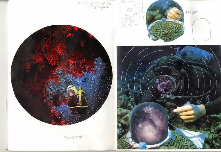
I started thinking about the similarities between the deep sea and outer space and the humans that explore them - both are inhospitable, alien environments, humans are buoyant in these settings, and deep sea divers and astronauts are somewhat similar aesthetically as well as in terms of what they do. I started playing around with pictures of divers from a book I have and making them look like they were in space through painting and collage.


I found a picture in an old encyclopaedia which I found interesting, it was a diagram of Ptolemy's geocentric model of the universe. I thought that tied in nicely with the unknown, as it made me reflect on advances in our knowledge, and also the fact that in several hundred years our theories for the universe may look outdated and ridiculous too. I also liked the concentric circle design and decided to include it in some collages.


I liked the concentric circles and how they tied in with motion capture photos of stars, shoals of fish and so on. I toyed with the idea of coral looking like planets/moons and the holes looking like craters.


I continued to make collages in this vein. I particularly like the one below right, with the bell jar as a metaphor for the universe and the diver as a metaphor for "God".


I briefly digressed into the bell jar idea, and also into the idea of the Bermuda triangle which wasn't so successful. The timescale of this project was definitely a struggle for me as it was difficult to resolve such a short project.


Next week I'm going to try screen-printing some of the images I made and hopefully bring the project to a close.