Showing posts with label collage. Show all posts

Thursday, 13 October 2016

Flat Earth News


Devotees of my work will surely remember my seminal Flat Earth installation and accompanying screen-printed book that I made at the end of 2015. Since then ideas about Flat Earth theory have been nagging away in my mind like some kind of well-meaning but irritating acquaintance so I have decided to explore it further and make a more resolved and visually satisfying project.

The main bulk of my work this year is 4 projects - 2 per semester - so they're supposed to be fairly weighty. For my first project of the year I decided to make a newsletter based on the Flat Earth News which the Flat Earth Society published in the 70s-90s, Reading the newsletters I was struck by the ridiculous phrasing and naive graphic design and thought it could be fun to make my own version as a sort of parody.


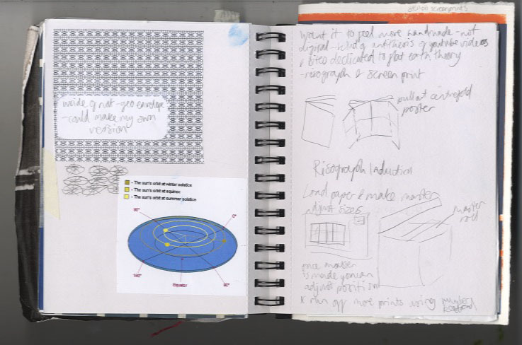

I started doing more research into Flat Earth theory and thinking about various subscription-based and fringe publications. I tried some risographs and stencil screenprints


I was struggling a bit to focus my ideas so decided to make the first edition a "Broader Horizon" issue and started developing some garish visuals and ideas which were quite in keeping with my installation. I was becoming frustrated with it though as I was finding it difficult to make anything that actually looked good, then I had a crit and completely psyched myself out about the whole idea, feeling that it wasn't enough, and veered very off course.
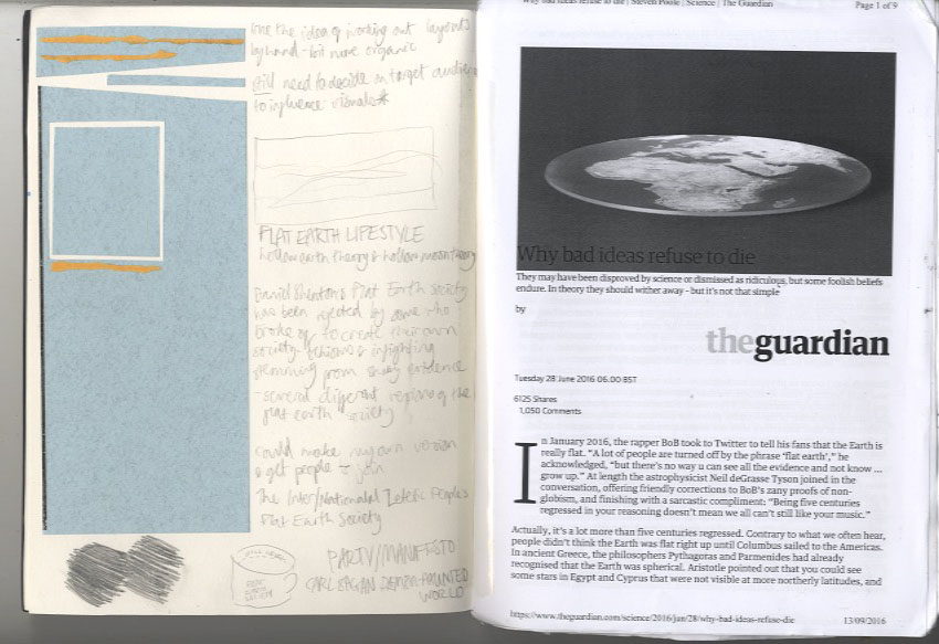

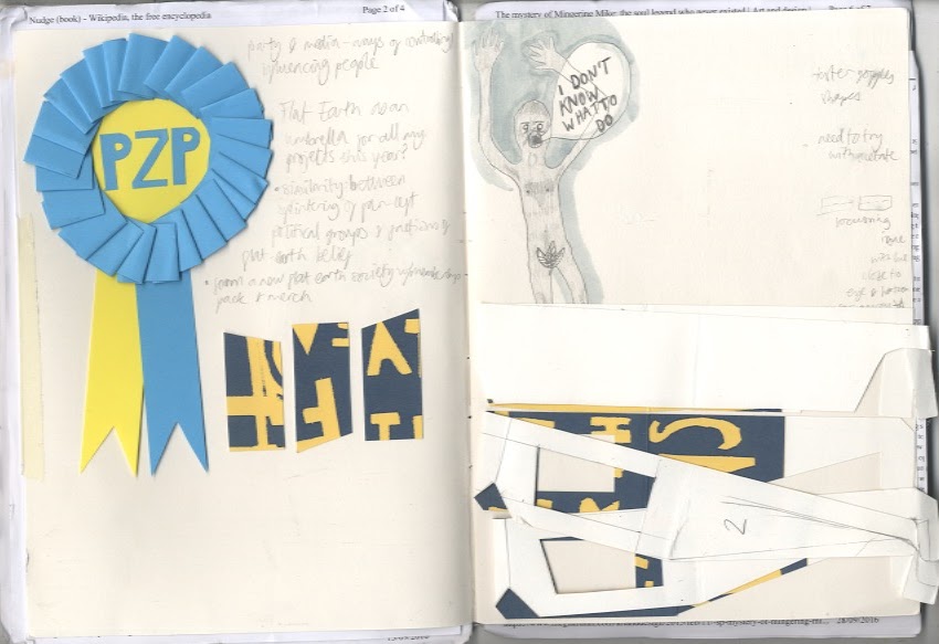
I did loads of research reading some articles and a collection of articles in book form called Lost At Sea by Jon Ronson. In that I read an article about a man who reinvented himself as a soul singer called Mingering Mike and made cardboard records, record sleeves, and recorded tapes spanning an entire fictional career. This got me thinking about outsider art which was interesting, learning about people with an uncontrollable urge to make things without necessarily intending anyone to see them. This made me feel pretty bad considering I had been sitting about for weeks doing virtually hee haw in an attempt to come up with something really original and smart. The more you think about creativity the more it can completely elude you, and the act of making can spark ideas, so I decided to revert back to my artists' block go-to and make some collages.


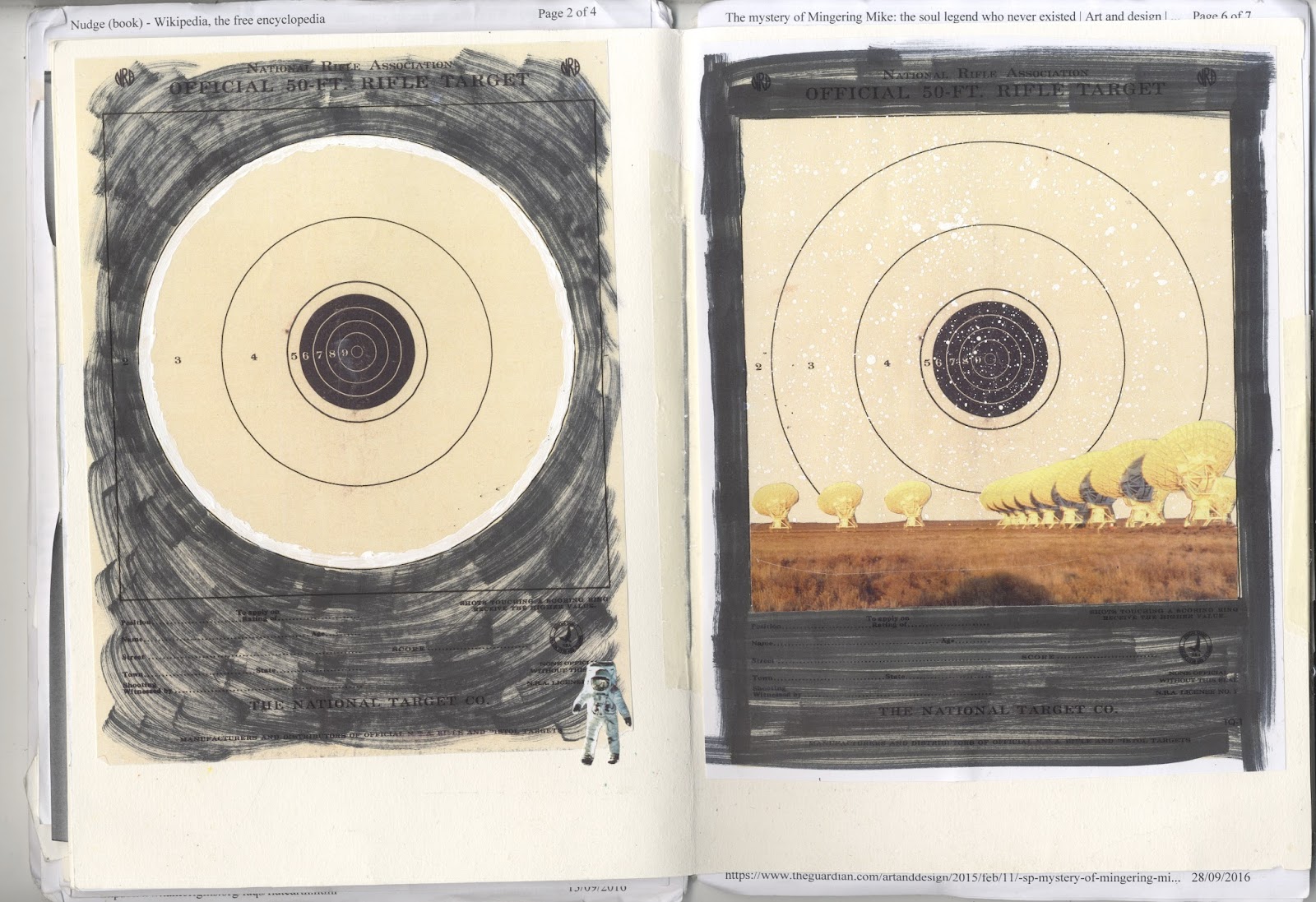
I was thinking about dimensions and flatness and made a collage with paving slabs which I thought was quite effective:


It was the only thing I'd done so far which I found visually rewarding so I got more photos of pavements and started playing about with collage screen-prints:


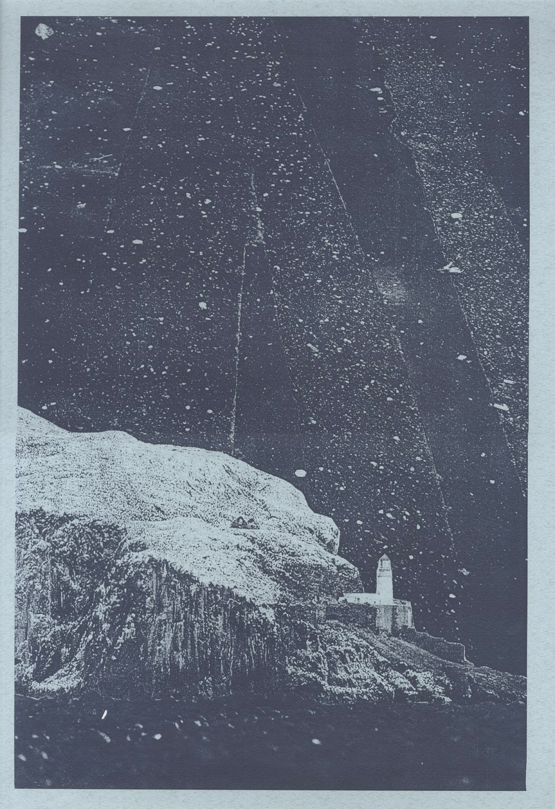


I'm pretty happy with how they look so far - I feel much better about the project now that I actually have something to show for it. Now I just need to work out how to bring together all the separate elements I've been thinking about into a final piece.

Monday, 14 September 2015

Creme Fresh Final Poster

After working on the two designs we decided that the blue and gold room looked best. I like the contrast between the ornately designed room and the space station as they look entirely different and serve different purposes, decoration vs. function, but are linked by their origins in human imagination. I like the contrast of the enclosed space (the room) and the vast infinity of space which could symbolise the intimate club setting contrasting with the "musical journey" the clubber goes on (if you wanted to be really cringey). The wee guy on the control panel also made me think of a DJ which made me laugh a bit as I wanted the image to be quite decorative but also a bit playful. 

I started playing around with the text on Photoshop and made quite a few changes to really tighten up the layout. We also decided to add a drop shadow to some of the text to make it stand out and I made the text cream as well.


Although reactions to the poster have been a bit mixed I'm really pleased with the outcome and think it stands out from most of the club posters I've seen. I also did a banner for the Facebook event:


... and a double sided flyer, the idea being that as the club nights progress there will be a series of images for people to collect adding to the value of the advertising and making the night a bit more creative:

Friday, 11 September 2015

Creme Fresh Poster Development

Took a break from the poster to go to Dimensions festival in Croatia which was amazing. It gave me some time to mull things over so I came back to the project quite refreshed. I added in the phrase "all night party music" at Duncan's request. Despite this I think my first attempt looked pretty stale and didn't stray that far from what I'd done before so I felt a bit disheartened.


Feeling a bit nervous about the project I came into the studio yesterday and decided to just completely start again with the imagery (but keep the traced and cut out text which I liked). I had a look through my books and took some photocopies then started playing around with pure collage. I wanted to come up with something relating to human ingenuity  - art, music and science which to me are all pinnacles of human achievement. My main stimuli for the poster were imagination/creativity and playing about with scale and space. This approach suited me much better and I came up with three images that I was pleased with:


I sent them over to Duncan. We agreed that the two images set in a room were the most dynamic. He also asked that I change "all night party music" to "party music all night long" which reads better. 

Thursday, 3 September 2015

Creme Fresh Poster Design

Been busy over the summer with work and holidays which has been great though I'm feeling a bit lazy on the art front. Now I'm almost starting back at uni though I feel like getting back into a project so I've been working on a poster commission for a friends' club night - Creme Fresh - which is starting up in Edinburgh.

Duncan wanted the poster to be along the same lines as some of my collage work in style. He had quite a strong idea about coherent branding so I looked at the covers he'd done for some of the Creme Fresh internet radio shows for inspiration.


As an obvious place to start I used the same font, and also thought about the pictures he'd chosen which were very disparate in content but had a similar feel in terms of humour and general strangeness. This is something that appeals to me so I had a search through some books and found some pictures which I thought worked and started playing about with them.


I made a couple of mock-ups and sent them over to Duncan.


He liked the second image the best so I started working on that in Photoshop playing about with the text and came up with this final version:


I was pretty happy with the way it looked but several people said that it reminded them of slaves/migrant boats (racists) which obviously isn't ideal when promoting a club night so I had to start over.

Thursday, 28 May 2015

Felis Comic

My last project of the term (halfway through art school already!) was to produce an autobiographical comic, a task I had been dreading as it pushed me so far out of my comfort zone and coincided with some other deadlines which were stressing me out. When I got down to it though, I was pleasantly surprised by how much I enjoyed coming up with an idea and doing something a bit different from my usual style. I decided to focus on childhood memories of being driven to a caravan on holiday and how familiar and safe the journey felt, as well as doing a homage to my dearly departed cat Murphy with a bit of a dream sequence type thing. 


 As drawing from imagination is a serious challenge for me I went with a loose style using ink and watercolours in a muted pallete, and collage for the dream sequence. I chose the title "Felis", which is the cat constellation named by the astronomer and cat lover Jérôme Lalande in 1799. I thought it tied in well with the cat and space themes in my comic.


I got it printed as a zine which you can buy here (and have a look at my other stuff too).