Wednesday, 8 March 2017
Tuesday, 7 March 2017
Rinse & Repeat - Window Display
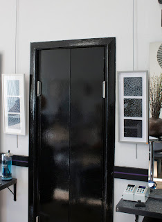
My most recent window display has been for my exhibition at Freedom. Having thought a lot about framing my prints prior to the exhibition I thought it could be an interesting take on the window display to make a sort of expanded version of these, painting a frame onto the window and suspending prints behind it. I decided to make large variations of some of the prints I had in the show. I printed them using fairly transparent inks onto drafting film which is a sort of translucent plastic paper.

The install was quite fiddly; screwing the hooks into the ceiling was the most time-consuming part and it got very toasty under the lights! Hanging the prints straight was also tricky taking a lot of trial and error. That's part of the challenge and appeal of window displays for me - designs that seem simple can often take a lot of work to take into the real 3-dimensional world.
It was also the shortest time I'd had to install a window display - only an hour and a half or so. As the components were ready-made however it was just a case of assembling everything and I'm really happy with the results:
I used drafting film as I was keen for the display to look just as good from the inside as the outside - which hasn't always been the case in previous window displays I've done. This paid off well - I'm so happy with the interior view with the light shining through the prints and the cast shadow from the frame I painted on the window and the other solid components:
Saturday, 25 February 2017
Rinse and Repeat exhibition at Freedom Hair Experience
I love doing craft fairs but have sometimes been disappointed in the past with lower sales than I'd hoped for (compounded by my chronic inability to price my work correctly).
At Dundee Ministry of Crafts last October however, I was reminded that events like these are such a great opportunity to meet people with unexpected consequences. I had a stall opposite Suzanne Scott of WhimSicAL LusH, a local artist I had known of but who I had never met before. We got chatting and a week or so later she got in touch offering me the chance to put on an exhibition at Freedom Hair Experience on Dock Street. Suzanne has been curating exhibitions at Freedom for a few years now and I was so grateful for the opportunity to be involved in the project.
Irving at Freedom gave me total creative control of the exhibition, so I got to design the poster, choose what work to include and produce a window display. I titled the exhibition Rinse and Repeat, as all of the prints I included had elements relating to water and pattern, and I liked the idea of the title referencing the unconventional setting. I installed the exhibition on Thursday night with help from Suzanne and Irving. It was so satisfying getting to fill the space with my work.
I felt really supported throughout the process of planning the exhibition and felt there was a real effort made to promote the exhibition. Suzanne did some filming with me which I'll blog about later and also interviewed me which you can read here.
The opening was last night and it went really well - Irving was so generous providing refreshments for the evening and I was really pleased with the turnout and feedback I got from people.
The exhibition is up until mid March. It's a great feeling knowing that so many people will be looking at my work! I'll post more pictures of the work on display and the process of creating the window display soon.
Fumetto
"Worlds – Where do you live and where do I live? Every story needs pictures, so I will make myself a picture of you. However, what do we really know about each other? How does your world influence mine and and mine yours? How does the world that we are creating together look?"
Following this oddly phrased brief for the Fumetto comic competition, I came up with quite an abstract narrative about two characters from different environments coming together and subverting each others' worlds.
The two characters - a disembodied hand and a pair of shears - live respectively in an environment delineated by positive/negative grids and a creased patterned fabric environment. The irony is that the characters are more suited to each others worlds, with a playful opposition of soft vs. rigid.
I spent a very long time working out compositions for each page, choosing a progressively more unconventional format to reflect the disruption caused by interaction between characters.
I chose to produce the comics using acetone transfers and screen-printing to clearly mark the separate worlds. I printed the characters on different papers and cut and pasted them onto the backgrounds which was more time-consuming than I'd anticipated - careful registration to integrate the characters into the prints would have probably been more effective, but I've learned my lesson!
The brief restricted the comic to a maximum of 4 loose-leaf pages of A4 or A3 size - here are my final prints on A3 paper:
Monday, 13 February 2017
Medal Project
"I propose to show that God, in creating the universe and arranging the spheres, had in view the five regular solids of geometry, and fixed by their dimensions the number, proportions and motions of the spheres."
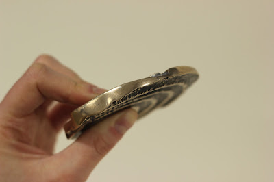
I cast this medal in bronze using the lost-wax casting process. It is based on the 17th Century scientist and theologian Johannes Kepler's theory of Cosmic Geometry.
Thursday, 13 October 2016
Flat Earth News
Devotees of my work will surely remember my seminal Flat Earth installation and accompanying screen-printed book that I made at the end of 2015. Since then ideas about Flat Earth theory have been nagging away in my mind like some kind of well-meaning but irritating acquaintance so I have decided to explore it further and make a more resolved and visually satisfying project.
The main bulk of my work this year is 4 projects - 2 per semester - so they're supposed to be fairly weighty. For my first project of the year I decided to make a newsletter based on the Flat Earth News which the Flat Earth Society published in the 70s-90s, Reading the newsletters I was struck by the ridiculous phrasing and naive graphic design and thought it could be fun to make my own version as a sort of parody.
I started doing more research into Flat Earth theory and thinking about various subscription-based and fringe publications. I tried some risographs and stencil screenprints
I was struggling a bit to focus my ideas so decided to make the first edition a "Broader Horizon" issue and started developing some garish visuals and ideas which were quite in keeping with my installation. I was becoming frustrated with it though as I was finding it difficult to make anything that actually looked good, then I had a crit and completely psyched myself out about the whole idea, feeling that it wasn't enough, and veered very off course.
I did loads of research reading some articles and a collection of articles in book form called Lost At Sea by Jon Ronson. In that I read an article about a man who reinvented himself as a soul singer called Mingering Mike and made cardboard records, record sleeves, and recorded tapes spanning an entire fictional career. This got me thinking about outsider art which was interesting, learning about people with an uncontrollable urge to make things without necessarily intending anyone to see them. This made me feel pretty bad considering I had been sitting about for weeks doing virtually hee haw in an attempt to come up with something really original and smart. The more you think about creativity the more it can completely elude you, and the act of making can spark ideas, so I decided to revert back to my artists' block go-to and make some collages.
I was thinking about dimensions and flatness and made a collage with paving slabs which I thought was quite effective:
It was the only thing I'd done so far which I found visually rewarding so I got more photos of pavements and started playing about with collage screen-prints:
I'm pretty happy with how they look so far - I feel much better about the project now that I actually have something to show for it. Now I just need to work out how to bring together all the separate elements I've been thinking about into a final piece.
Subscribe to:
Comments (Atom)


