Showing posts with label project. Show all posts

Thursday, 13 October 2016

Flat Earth News


Devotees of my work will surely remember my seminal Flat Earth installation and accompanying screen-printed book that I made at the end of 2015. Since then ideas about Flat Earth theory have been nagging away in my mind like some kind of well-meaning but irritating acquaintance so I have decided to explore it further and make a more resolved and visually satisfying project.

The main bulk of my work this year is 4 projects - 2 per semester - so they're supposed to be fairly weighty. For my first project of the year I decided to make a newsletter based on the Flat Earth News which the Flat Earth Society published in the 70s-90s, Reading the newsletters I was struck by the ridiculous phrasing and naive graphic design and thought it could be fun to make my own version as a sort of parody.


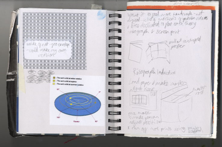

I started doing more research into Flat Earth theory and thinking about various subscription-based and fringe publications. I tried some risographs and stencil screenprints


I was struggling a bit to focus my ideas so decided to make the first edition a "Broader Horizon" issue and started developing some garish visuals and ideas which were quite in keeping with my installation. I was becoming frustrated with it though as I was finding it difficult to make anything that actually looked good, then I had a crit and completely psyched myself out about the whole idea, feeling that it wasn't enough, and veered very off course.
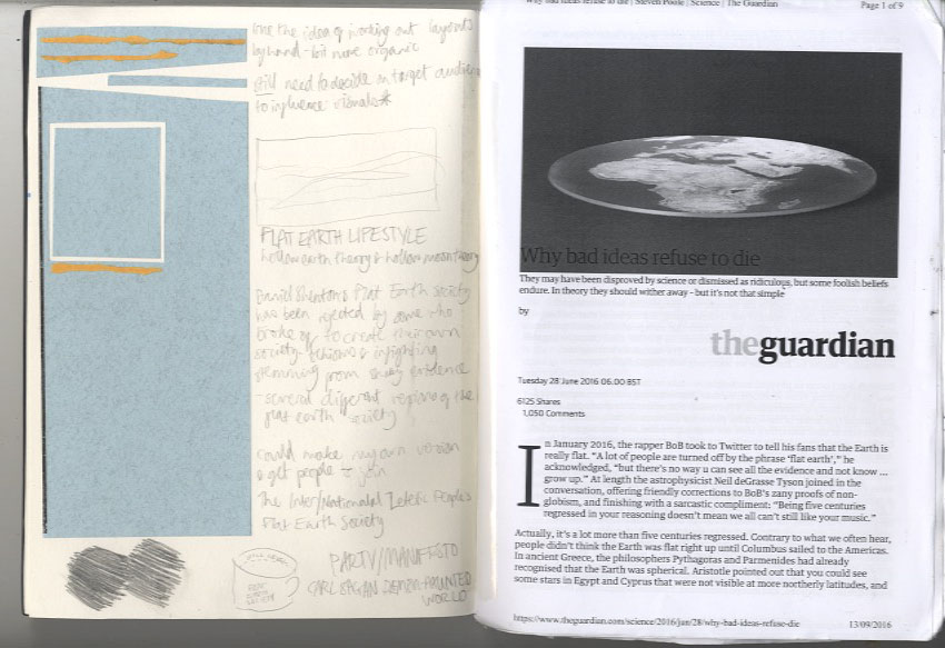

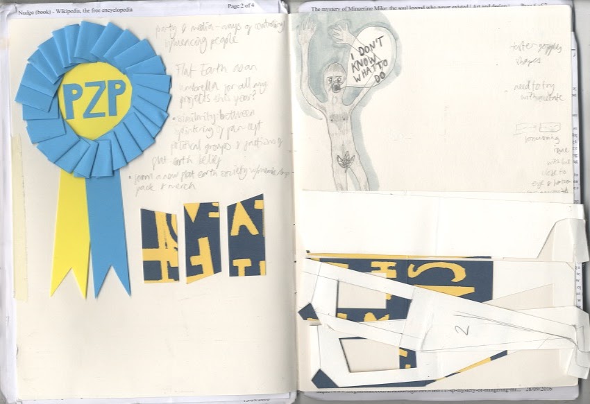
I did loads of research reading some articles and a collection of articles in book form called Lost At Sea by Jon Ronson. In that I read an article about a man who reinvented himself as a soul singer called Mingering Mike and made cardboard records, record sleeves, and recorded tapes spanning an entire fictional career. This got me thinking about outsider art which was interesting, learning about people with an uncontrollable urge to make things without necessarily intending anyone to see them. This made me feel pretty bad considering I had been sitting about for weeks doing virtually hee haw in an attempt to come up with something really original and smart. The more you think about creativity the more it can completely elude you, and the act of making can spark ideas, so I decided to revert back to my artists' block go-to and make some collages.


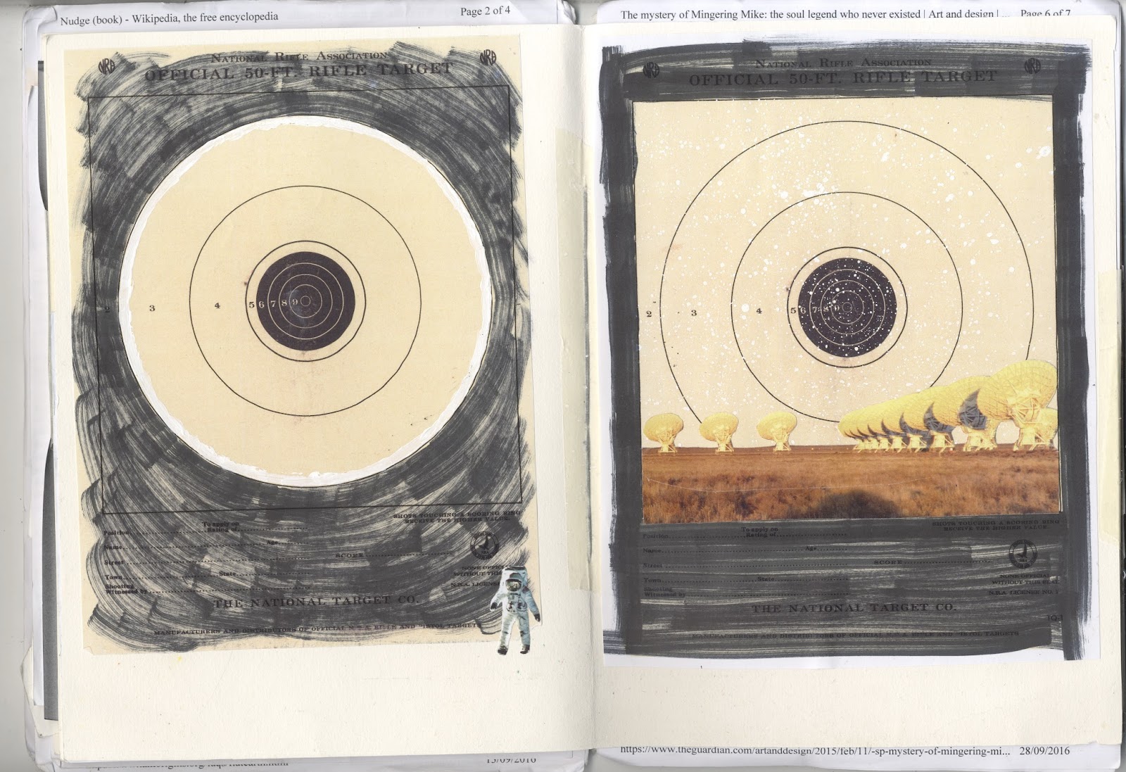
I was thinking about dimensions and flatness and made a collage with paving slabs which I thought was quite effective:


It was the only thing I'd done so far which I found visually rewarding so I got more photos of pavements and started playing about with collage screen-prints:


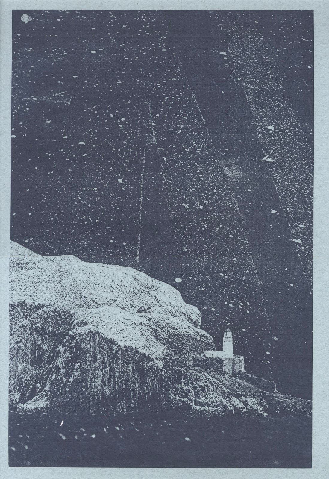


I'm pretty happy with how they look so far - I feel much better about the project now that I actually have something to show for it. Now I just need to work out how to bring together all the separate elements I've been thinking about into a final piece.

Wednesday, 16 December 2015

Art and Science - Flat Earth Installation

Art and Science exhibition was on Monday! Making the installation itself took a fair amount of work and took me out of my comfort zone venturing into the woodwork department. I didn't know how it would look all together until I assembled everything on the day of the exhibition and I was pleasantly surprised - while it's garish it isn't as horrendous as I'd feared which is the main thing.


The installation uses primary colours plus black and white. I decided to exclude other colours as a reference to exclusion of evidence and I actually really like the way it looks. All the elements focus on the idea of Zetetics - trusting your senses above all other evidence which ties in nicely with my visual way of thinking about things as an artist.

I also edited the conversation between David and Adam to manipulate their words and make it seem as they were in support of flat earth theory.

The installation got mixed reactions probably due to the "eye-catching" nature of it but I love the way it looks and I'm really proud of it! It was nice to work on a larger scale and I feel I definitely challenged myself producing some of the elements. All in all a good semesters work!

Saturday, 6 December 2014

Summer Project

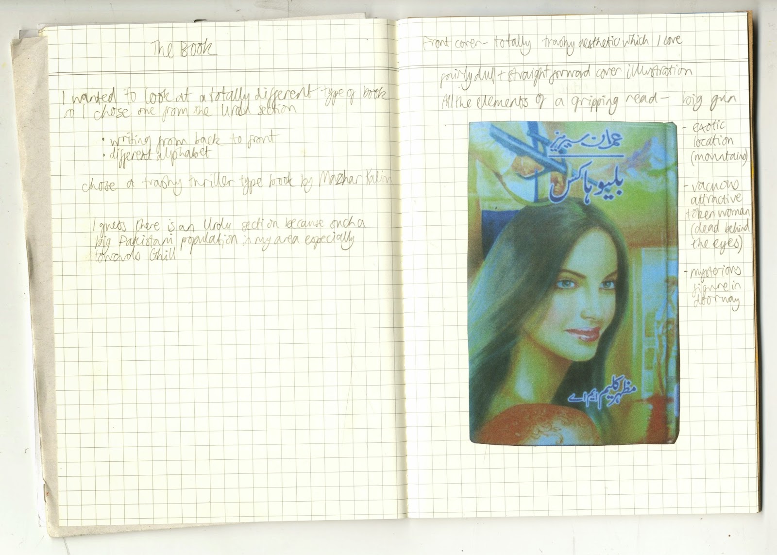
The brief for my summer project this year was called "Library and the Book" and was about the process of visiting a library and choosing a book, with the final outcome to be an A3 poster. I started by taking some photos and doing some sketchbook work about the journey to my local library.


It was nice to do some exploring of my local area. When I got the library I had a look around and was drawn to the Urdu section because I like look of the writing. I had a look through the books and was drawn to the ones with cheap looking covers and eventually chose a trashy looking thriller. 


As it was in Urdu I couldn't understand the content so just focused on its physical qualities and appearance. The book read from back to front which was interesting. I liked the fact that it was cheaply and poorly printed and the garish, trashy graphic design.


A couple of the pages were torn and scribbled on with crayon which gave some clues about the people that had read it before. I decided to use crayon to make my final poster. I found it interesting how the image of the woman was a central part of the cover design, but I felt that she wasn't a central or well developed character, more of a sex object or motive for the other characters. For my final poster I drew a background of mountains inspired by the mountains on the cover of the book. I drew a portrait of a woman in blue referencing the author photo on the back cover, incorporated text, and finally scribbled over her face to partially obscure her. I guess the poster is kind of meant to show my frustration at the lack of convincing/important female characters.