Showing posts with label sketchbook. Show all posts

Thursday, 13 October 2016

Flat Earth News


Devotees of my work will surely remember my seminal Flat Earth installation and accompanying screen-printed book that I made at the end of 2015. Since then ideas about Flat Earth theory have been nagging away in my mind like some kind of well-meaning but irritating acquaintance so I have decided to explore it further and make a more resolved and visually satisfying project.

The main bulk of my work this year is 4 projects - 2 per semester - so they're supposed to be fairly weighty. For my first project of the year I decided to make a newsletter based on the Flat Earth News which the Flat Earth Society published in the 70s-90s, Reading the newsletters I was struck by the ridiculous phrasing and naive graphic design and thought it could be fun to make my own version as a sort of parody.


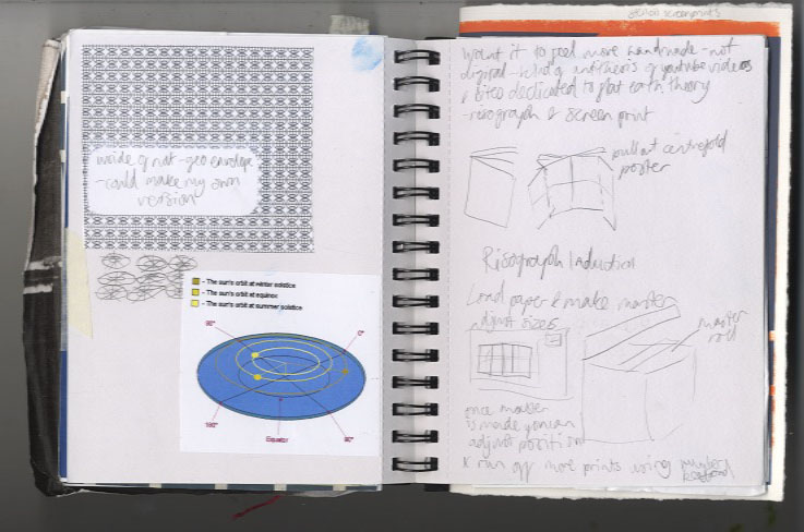

I started doing more research into Flat Earth theory and thinking about various subscription-based and fringe publications. I tried some risographs and stencil screenprints


I was struggling a bit to focus my ideas so decided to make the first edition a "Broader Horizon" issue and started developing some garish visuals and ideas which were quite in keeping with my installation. I was becoming frustrated with it though as I was finding it difficult to make anything that actually looked good, then I had a crit and completely psyched myself out about the whole idea, feeling that it wasn't enough, and veered very off course.
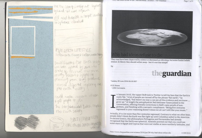

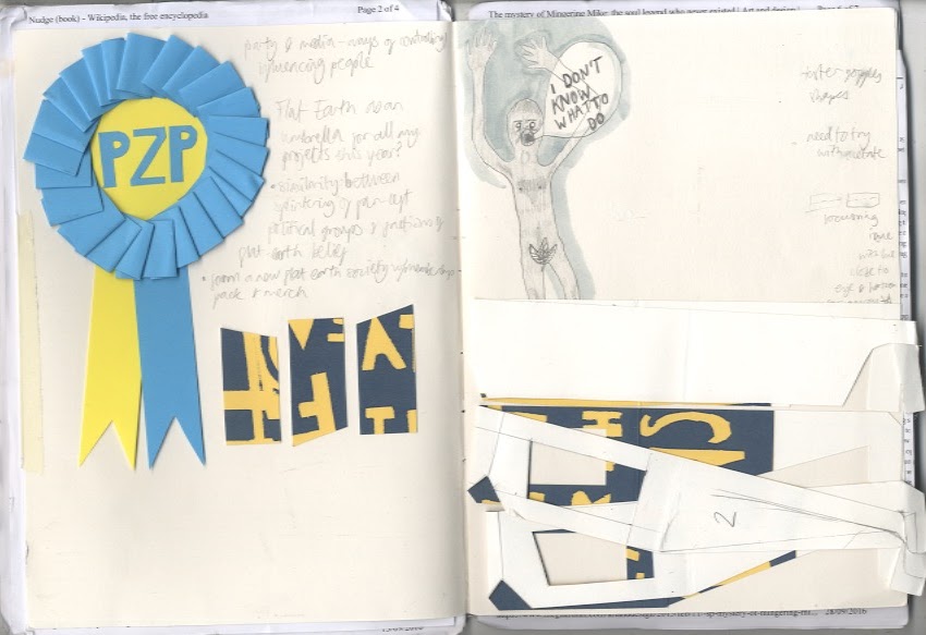
I did loads of research reading some articles and a collection of articles in book form called Lost At Sea by Jon Ronson. In that I read an article about a man who reinvented himself as a soul singer called Mingering Mike and made cardboard records, record sleeves, and recorded tapes spanning an entire fictional career. This got me thinking about outsider art which was interesting, learning about people with an uncontrollable urge to make things without necessarily intending anyone to see them. This made me feel pretty bad considering I had been sitting about for weeks doing virtually hee haw in an attempt to come up with something really original and smart. The more you think about creativity the more it can completely elude you, and the act of making can spark ideas, so I decided to revert back to my artists' block go-to and make some collages.


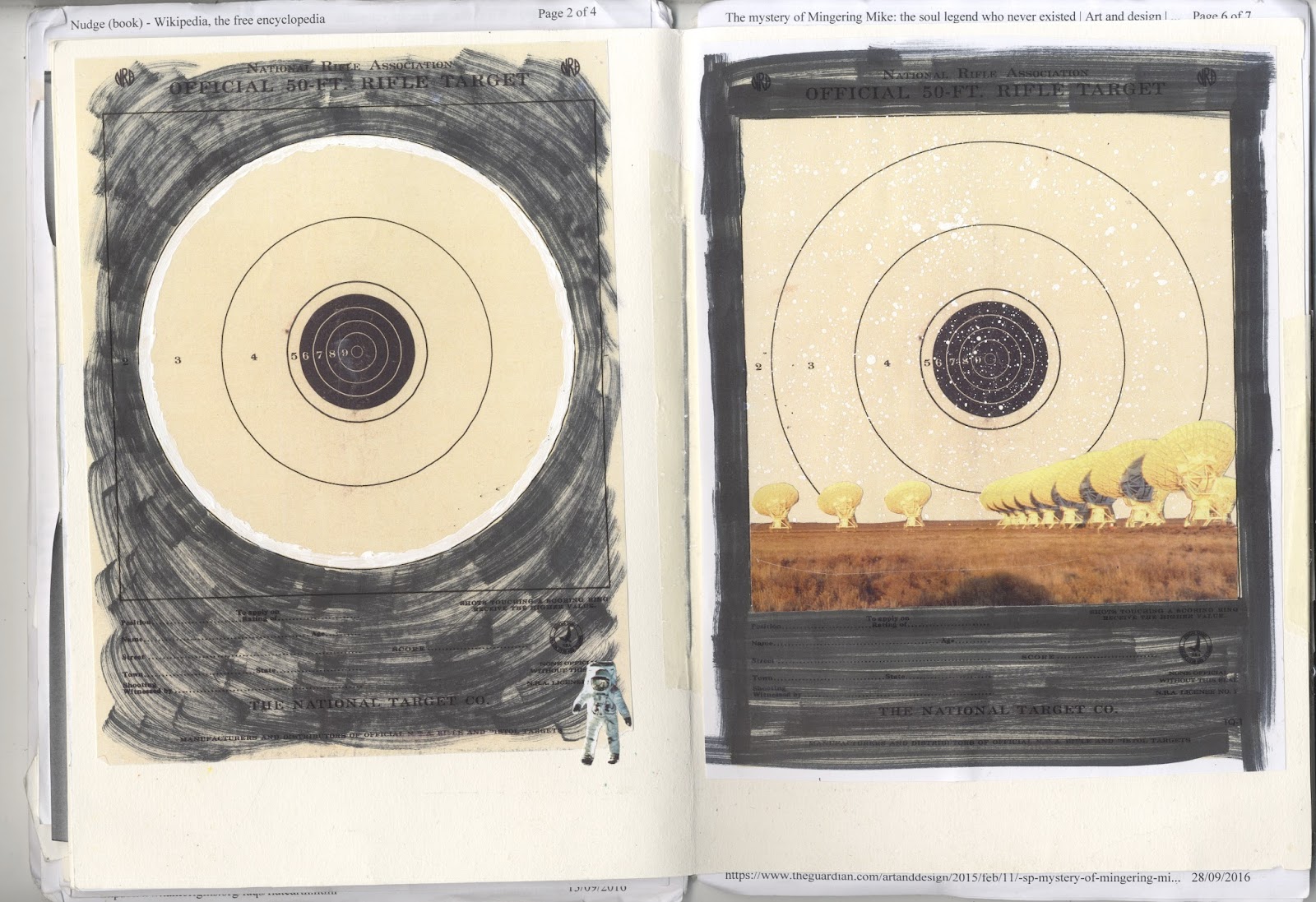
I was thinking about dimensions and flatness and made a collage with paving slabs which I thought was quite effective:


It was the only thing I'd done so far which I found visually rewarding so I got more photos of pavements and started playing about with collage screen-prints:


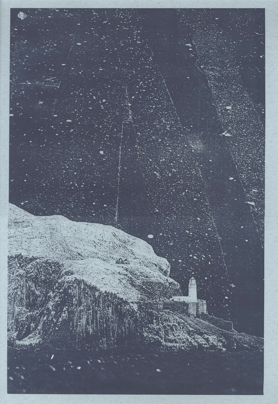


I'm pretty happy with how they look so far - I feel much better about the project now that I actually have something to show for it. Now I just need to work out how to bring together all the separate elements I've been thinking about into a final piece.

Tuesday, 15 December 2015

House of Illustration & Folio Society Competition - War Horse

My final illustration brief this semester has been pretty hard work - it's for the House of Illustration and Folio Society book illustration competition which is a big deal in the illustration world. We were tasked to produce 3 illustrations and a binding for the book "War Horse" by Michael Morpurgo, which I can safely say is now my least favourite book... Although War Horse is relatively short and being a childrens' book, a pretty easy read, I still found it difficult trawling through all the text and choosing scenes to illustrate as well as deciding on a style. I started off by looking at horses and different ways to draw them.


I didn't want to go for anything too literal so I then looked at simple cut out shapes and abstraction of the figures.


I eventually chose three scenes which I thought kind of summed up the main themes of the book and also featured most of the main characters; the ploughing scene at the start; the scene where the horses are being transported to France by ship in the middle; then the no-mans' land scene towards the end.


I also decided to make the binding quite simple and graphic using the shape of an aerial view of a hay field which has been partially harvested - symbolic of Joey and Topthorn being taken away from the farm in France.

Thursday, 3 September 2015

Creme Fresh Poster Design

Been busy over the summer with work and holidays which has been great though I'm feeling a bit lazy on the art front. Now I'm almost starting back at uni though I feel like getting back into a project so I've been working on a poster commission for a friends' club night - Creme Fresh - which is starting up in Edinburgh.

Duncan wanted the poster to be along the same lines as some of my collage work in style. He had quite a strong idea about coherent branding so I looked at the covers he'd done for some of the Creme Fresh internet radio shows for inspiration.


As an obvious place to start I used the same font, and also thought about the pictures he'd chosen which were very disparate in content but had a similar feel in terms of humour and general strangeness. This is something that appeals to me so I had a search through some books and found some pictures which I thought worked and started playing about with them.


I made a couple of mock-ups and sent them over to Duncan.


He liked the second image the best so I started working on that in Photoshop playing about with the text and came up with this final version:


I was pretty happy with the way it looked but several people said that it reminded them of slaves/migrant boats (racists) which obviously isn't ideal when promoting a club night so I had to start over.