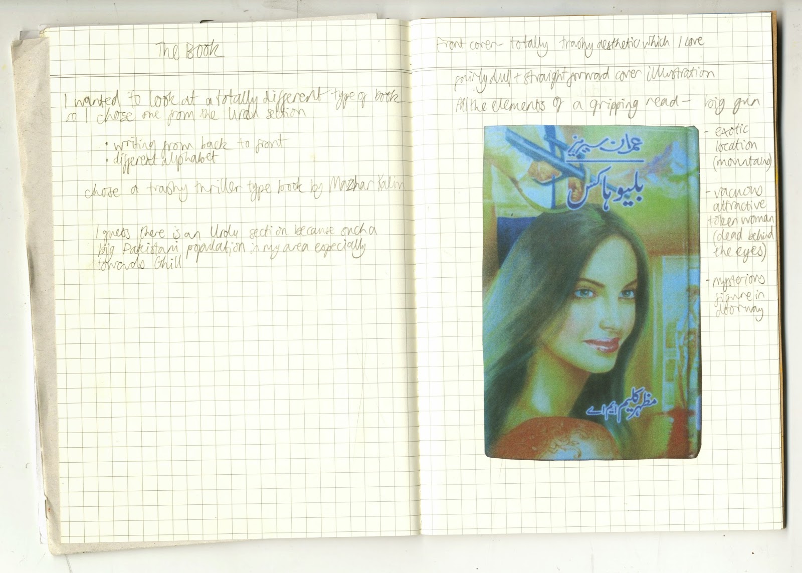
It was nice to do some exploring of my local area. When I got the library I had a look around and was drawn to the Urdu section because I like look of the writing. I had a look through the books and was drawn to the ones with cheap looking covers and eventually chose a trashy looking thriller.
As it was in Urdu I couldn't understand the content so just focused on its physical qualities and appearance. The book read from back to front which was interesting. I liked the fact that it was cheaply and poorly printed and the garish, trashy graphic design.
A couple of the pages were torn and scribbled on with crayon which gave some clues about the people that had read it before. I decided to use crayon to make my final poster. I found it interesting how the image of the woman was a central part of the cover design, but I felt that she wasn't a central or well developed character, more of a sex object or motive for the other characters. For my final poster I drew a background of mountains inspired by the mountains on the cover of the book. I drew a portrait of a woman in blue referencing the author photo on the back cover, incorporated text, and finally scribbled over her face to partially obscure her. I guess the poster is kind of meant to show my frustration at the lack of convincing/important female characters.


No comments:
Post a Comment