Showing posts with label book. Show all posts

Wednesday, 16 December 2015

Art and Science - Flat Earth Book

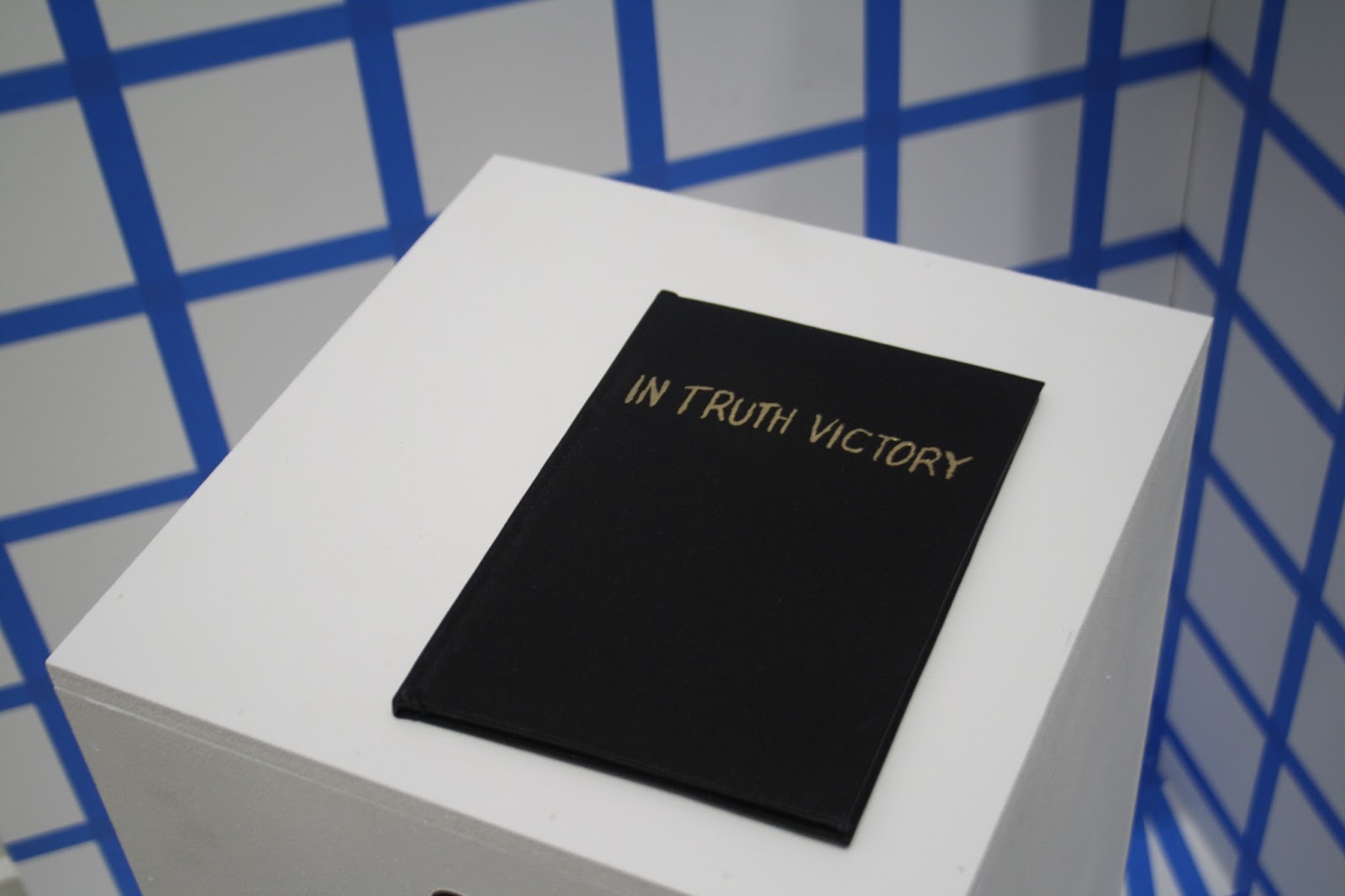
At the end of the Art and Science module I inexplicably decided I wanted to screenprint a 12-page, 2-colour book of evidence and bind and emboss the cover to be a part of the installation...

I trawled through a lot of old books published on the Flat Earth Society website as well as looking at Twitter for a modern perspective on the Flat Earth. I liked the idea that writing something down and printed it made it more official and with this in mind I made separations for the screenprinted book combining text and diagrams from the research I'd been doing and the handwritten quotes from Twitter. I like the idea of taking a quotation out of quotation marks making it into my own words.


I chose to use green ink for the writing as a reference to the journalistic joke about the green-ink brigade - possibly too obscure a joke but never mind.


Screenprinting the book was easier than I expected - I thought it would be a nightmare as it's double sided so had to be lined up accurately but it came out well. I wanted it to be properly bound so it looked official so I used binding cloth and used gold leaf for the title on the cover (I eventually decided against embossing as I was running out of time). It was my first time using binding cloth and gold leaf so I'm proud of the finished I achieved.



Tuesday, 15 December 2015

House of Illustration & Folio Society Competition - War Horse

My final illustration brief this semester has been pretty hard work - it's for the House of Illustration and Folio Society book illustration competition which is a big deal in the illustration world. We were tasked to produce 3 illustrations and a binding for the book "War Horse" by Michael Morpurgo, which I can safely say is now my least favourite book... Although War Horse is relatively short and being a childrens' book, a pretty easy read, I still found it difficult trawling through all the text and choosing scenes to illustrate as well as deciding on a style. I started off by looking at horses and different ways to draw them.


I didn't want to go for anything too literal so I then looked at simple cut out shapes and abstraction of the figures.


I eventually chose three scenes which I thought kind of summed up the main themes of the book and also featured most of the main characters; the ploughing scene at the start; the scene where the horses are being transported to France by ship in the middle; then the no-mans' land scene towards the end.


I also decided to make the binding quite simple and graphic using the shape of an aerial view of a hay field which has been partially harvested - symbolic of Joey and Topthorn being taken away from the farm in France.

Saturday, 6 December 2014

Summer Project

The brief for my summer project this year was called "Library and the Book" and was about the process of visiting a library and choosing a book, with the final outcome to be an A3 poster. I started by taking some photos and doing some sketchbook work about the journey to my local library.


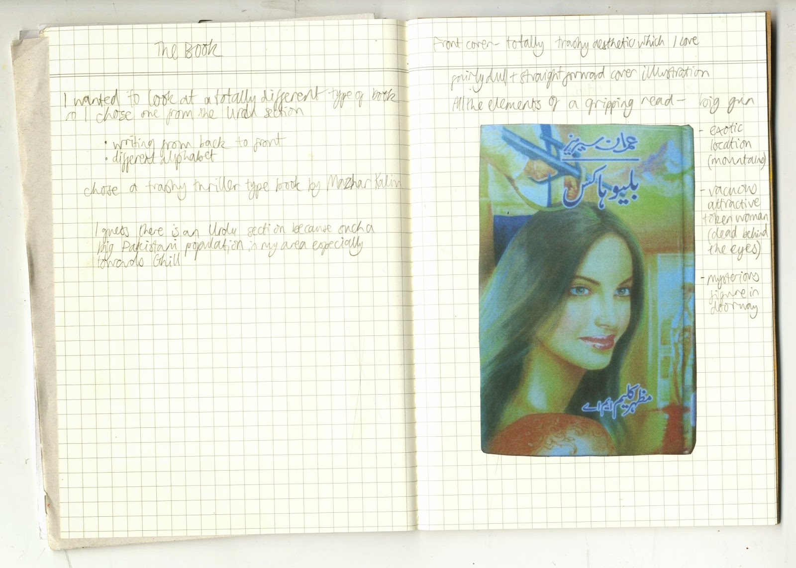
It was nice to do some exploring of my local area. When I got the library I had a look around and was drawn to the Urdu section because I like look of the writing. I had a look through the books and was drawn to the ones with cheap looking covers and eventually chose a trashy looking thriller. 


As it was in Urdu I couldn't understand the content so just focused on its physical qualities and appearance. The book read from back to front which was interesting. I liked the fact that it was cheaply and poorly printed and the garish, trashy graphic design.


A couple of the pages were torn and scribbled on with crayon which gave some clues about the people that had read it before. I decided to use crayon to make my final poster. I found it interesting how the image of the woman was a central part of the cover design, but I felt that she wasn't a central or well developed character, more of a sex object or motive for the other characters. For my final poster I drew a background of mountains inspired by the mountains on the cover of the book. I drew a portrait of a woman in blue referencing the author photo on the back cover, incorporated text, and finally scribbled over her face to partially obscure her. I guess the poster is kind of meant to show my frustration at the lack of convincing/important female characters.

Thursday, 31 July 2014

Arte Povera - Matches


One of the first things I did this year at art school was the Arte Povera project, the object being to produce a sculpture inspired by the Arte Povera movement. I didn't especially like the brief so I basically spent two weeks messing about with matches.


Like most of my projects I wasn't happy with this at the time but now I think it's actually a pretty successful project. I wanted the outcome to be fairly subtle and I spent a lot of time just doing different experiments, trying different methods of "drawing" such as smoke on tracing paper. I also liked the forms of the burnt out matches. I presented my final piece, a suspended sculpture, as a handmade book.