Showing posts with label poster. Show all posts

Monday, 14 September 2015

Creme Fresh Final Poster

After working on the two designs we decided that the blue and gold room looked best. I like the contrast between the ornately designed room and the space station as they look entirely different and serve different purposes, decoration vs. function, but are linked by their origins in human imagination. I like the contrast of the enclosed space (the room) and the vast infinity of space which could symbolise the intimate club setting contrasting with the "musical journey" the clubber goes on (if you wanted to be really cringey). The wee guy on the control panel also made me think of a DJ which made me laugh a bit as I wanted the image to be quite decorative but also a bit playful. 

I started playing around with the text on Photoshop and made quite a few changes to really tighten up the layout. We also decided to add a drop shadow to some of the text to make it stand out and I made the text cream as well.


Although reactions to the poster have been a bit mixed I'm really pleased with the outcome and think it stands out from most of the club posters I've seen. I also did a banner for the Facebook event:


... and a double sided flyer, the idea being that as the club nights progress there will be a series of images for people to collect adding to the value of the advertising and making the night a bit more creative:

Friday, 11 September 2015

Creme Fresh Poster Development

Took a break from the poster to go to Dimensions festival in Croatia which was amazing. It gave me some time to mull things over so I came back to the project quite refreshed. I added in the phrase "all night party music" at Duncan's request. Despite this I think my first attempt looked pretty stale and didn't stray that far from what I'd done before so I felt a bit disheartened.


Feeling a bit nervous about the project I came into the studio yesterday and decided to just completely start again with the imagery (but keep the traced and cut out text which I liked). I had a look through my books and took some photocopies then started playing around with pure collage. I wanted to come up with something relating to human ingenuity  - art, music and science which to me are all pinnacles of human achievement. My main stimuli for the poster were imagination/creativity and playing about with scale and space. This approach suited me much better and I came up with three images that I was pleased with:


I sent them over to Duncan. We agreed that the two images set in a room were the most dynamic. He also asked that I change "all night party music" to "party music all night long" which reads better. 

Thursday, 3 September 2015

Creme Fresh Poster Design

Been busy over the summer with work and holidays which has been great though I'm feeling a bit lazy on the art front. Now I'm almost starting back at uni though I feel like getting back into a project so I've been working on a poster commission for a friends' club night - Creme Fresh - which is starting up in Edinburgh.

Duncan wanted the poster to be along the same lines as some of my collage work in style. He had quite a strong idea about coherent branding so I looked at the covers he'd done for some of the Creme Fresh internet radio shows for inspiration.


As an obvious place to start I used the same font, and also thought about the pictures he'd chosen which were very disparate in content but had a similar feel in terms of humour and general strangeness. This is something that appeals to me so I had a search through some books and found some pictures which I thought worked and started playing about with them.


I made a couple of mock-ups and sent them over to Duncan.


He liked the second image the best so I started working on that in Photoshop playing about with the text and came up with this final version:


I was pretty happy with the way it looked but several people said that it reminded them of slaves/migrant boats (racists) which obviously isn't ideal when promoting a club night so I had to start over.

Wednesday, 4 March 2015

A Taste Of Honey Set and Poster Design

My first project this semester was a set and poster design on a given play, I was assigned Shelagh Delaney's "A Taste of Honey", a "kitchen-sink drama" from the 1950's.


The play contained lots of themes of motherhood and poverty which I wanted to tie into the poster. There were also themes of homophobia and racism which I felt were more relevant in Russia today than in Britain which is where the play was originally set. 


I did some research into set design and Russian housing and architecture.


For the poster design I took some photos of a baby doll to reference a key scene in the play where a character throws a doll to the ground to represent her own rejection by her mother and subsequent rejection of her child. I screenprinted it with text over it inspired by Constructivism which was a bit of an obvious choice but worked pretty well:


I wanted to keep the set design quite minimal based on tower blocks with an inside/outside section. I used a slide projector to project onto the set and made slides by printing onto acetate and painting and scratching over it with brusho ink.


Saturday, 6 December 2014

Summer Project

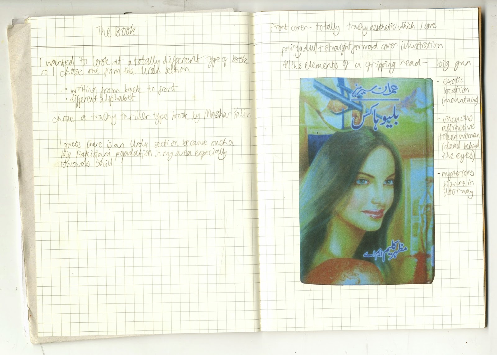
The brief for my summer project this year was called "Library and the Book" and was about the process of visiting a library and choosing a book, with the final outcome to be an A3 poster. I started by taking some photos and doing some sketchbook work about the journey to my local library.


It was nice to do some exploring of my local area. When I got the library I had a look around and was drawn to the Urdu section because I like look of the writing. I had a look through the books and was drawn to the ones with cheap looking covers and eventually chose a trashy looking thriller. 


As it was in Urdu I couldn't understand the content so just focused on its physical qualities and appearance. The book read from back to front which was interesting. I liked the fact that it was cheaply and poorly printed and the garish, trashy graphic design.


A couple of the pages were torn and scribbled on with crayon which gave some clues about the people that had read it before. I decided to use crayon to make my final poster. I found it interesting how the image of the woman was a central part of the cover design, but I felt that she wasn't a central or well developed character, more of a sex object or motive for the other characters. For my final poster I drew a background of mountains inspired by the mountains on the cover of the book. I drew a portrait of a woman in blue referencing the author photo on the back cover, incorporated text, and finally scribbled over her face to partially obscure her. I guess the poster is kind of meant to show my frustration at the lack of convincing/important female characters.