Showing posts with label cover. Show all posts

Wednesday, 16 December 2015

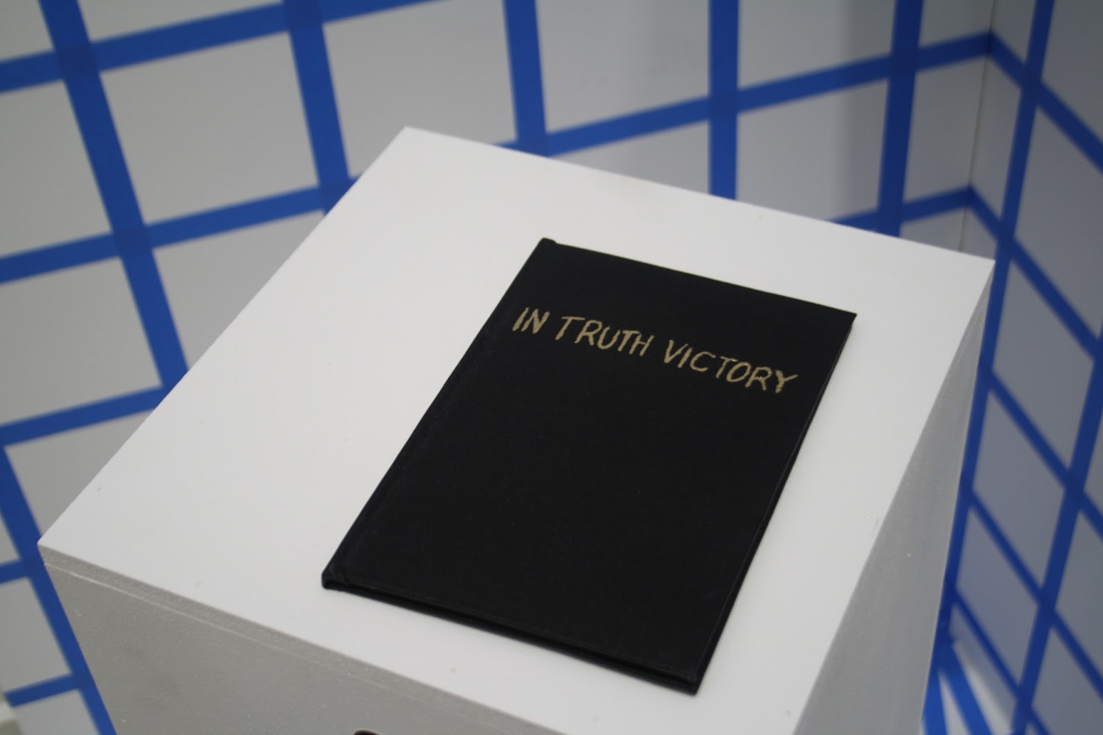
Art and Science - Flat Earth Book

At the end of the Art and Science module I inexplicably decided I wanted to screenprint a 12-page, 2-colour book of evidence and bind and emboss the cover to be a part of the installation...

I trawled through a lot of old books published on the Flat Earth Society website as well as looking at Twitter for a modern perspective on the Flat Earth. I liked the idea that writing something down and printed it made it more official and with this in mind I made separations for the screenprinted book combining text and diagrams from the research I'd been doing and the handwritten quotes from Twitter. I like the idea of taking a quotation out of quotation marks making it into my own words.


I chose to use green ink for the writing as a reference to the journalistic joke about the green-ink brigade - possibly too obscure a joke but never mind.


Screenprinting the book was easier than I expected - I thought it would be a nightmare as it's double sided so had to be lined up accurately but it came out well. I wanted it to be properly bound so it looked official so I used binding cloth and used gold leaf for the title on the cover (I eventually decided against embossing as I was running out of time). It was my first time using binding cloth and gold leaf so I'm proud of the finished I achieved.



Wednesday, 4 March 2015

Berghain Record

Another of my one-day projects was a record cover design on any chosen genre/artist/label which had to include the number twenty as a feature of the design. I looked into a few but decided to go for a "Berghain Greatest Hits" album as a sort of ironic take on compilations playing on the exclusivity of Berghain and how it has almost become a victim of its own success.


I was thinking about the idea of techno tourism and EDM fans coming from the US to experience a scene which ends up being totally different from their horribly misguided preconceptions of dance music. Eventually I went for a design influenced by Russian Constructivism as a nod to Berlin's Soviet past and used the colours of the German flag:

"We don't want you"