Showing posts with label design. Show all posts

Wednesday, 16 December 2015

Art and Science - Flat Earth Book

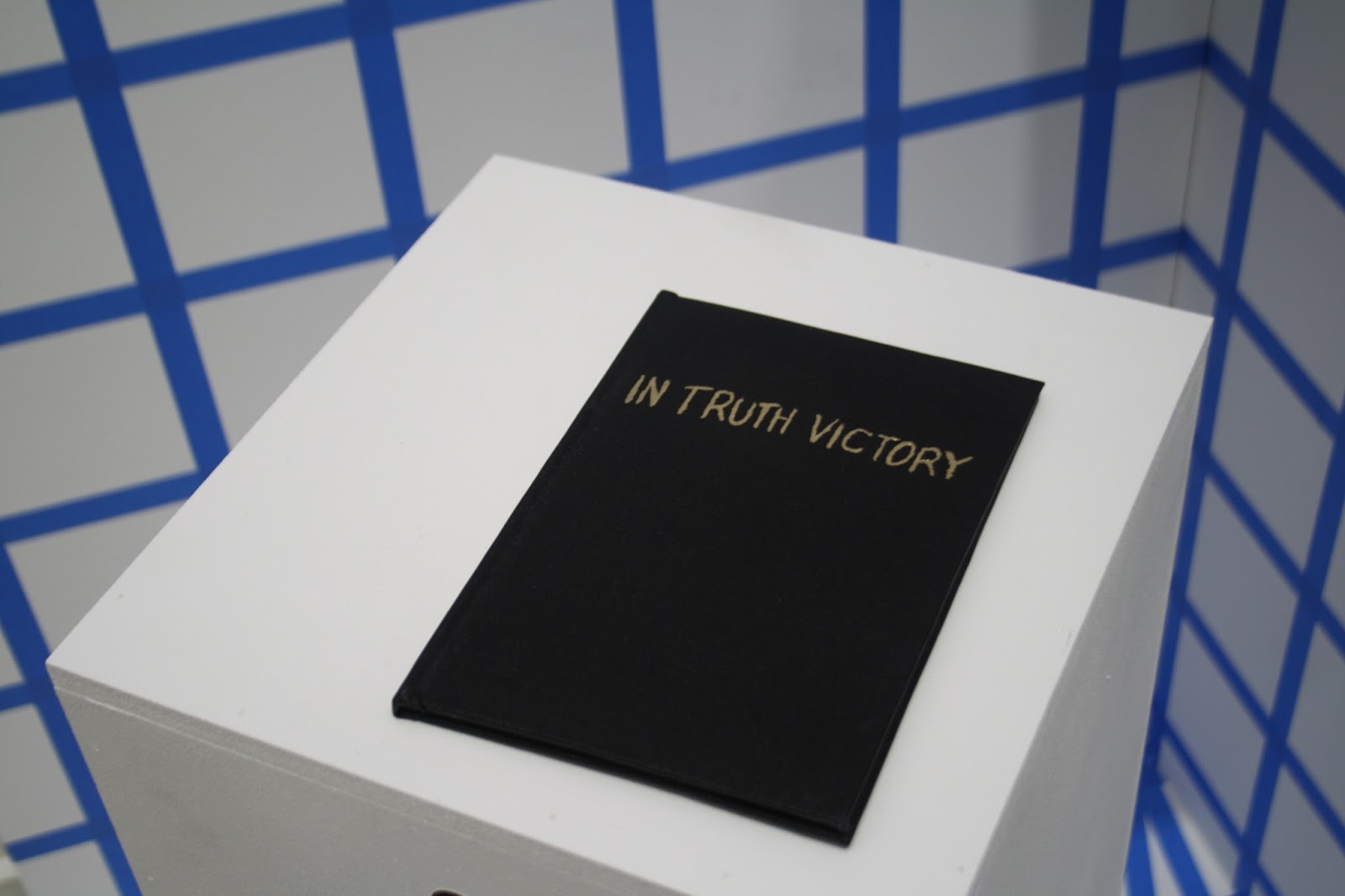
At the end of the Art and Science module I inexplicably decided I wanted to screenprint a 12-page, 2-colour book of evidence and bind and emboss the cover to be a part of the installation...

I trawled through a lot of old books published on the Flat Earth Society website as well as looking at Twitter for a modern perspective on the Flat Earth. I liked the idea that writing something down and printed it made it more official and with this in mind I made separations for the screenprinted book combining text and diagrams from the research I'd been doing and the handwritten quotes from Twitter. I like the idea of taking a quotation out of quotation marks making it into my own words.


I chose to use green ink for the writing as a reference to the journalistic joke about the green-ink brigade - possibly too obscure a joke but never mind.


Screenprinting the book was easier than I expected - I thought it would be a nightmare as it's double sided so had to be lined up accurately but it came out well. I wanted it to be properly bound so it looked official so I used binding cloth and used gold leaf for the title on the cover (I eventually decided against embossing as I was running out of time). It was my first time using binding cloth and gold leaf so I'm proud of the finished I achieved.



Monday, 14 September 2015

Creme Fresh Final Poster

After working on the two designs we decided that the blue and gold room looked best. I like the contrast between the ornately designed room and the space station as they look entirely different and serve different purposes, decoration vs. function, but are linked by their origins in human imagination. I like the contrast of the enclosed space (the room) and the vast infinity of space which could symbolise the intimate club setting contrasting with the "musical journey" the clubber goes on (if you wanted to be really cringey). The wee guy on the control panel also made me think of a DJ which made me laugh a bit as I wanted the image to be quite decorative but also a bit playful. 

I started playing around with the text on Photoshop and made quite a few changes to really tighten up the layout. We also decided to add a drop shadow to some of the text to make it stand out and I made the text cream as well.


Although reactions to the poster have been a bit mixed I'm really pleased with the outcome and think it stands out from most of the club posters I've seen. I also did a banner for the Facebook event:


... and a double sided flyer, the idea being that as the club nights progress there will be a series of images for people to collect adding to the value of the advertising and making the night a bit more creative:

Friday, 11 September 2015

Creme Fresh Poster Development

Took a break from the poster to go to Dimensions festival in Croatia which was amazing. It gave me some time to mull things over so I came back to the project quite refreshed. I added in the phrase "all night party music" at Duncan's request. Despite this I think my first attempt looked pretty stale and didn't stray that far from what I'd done before so I felt a bit disheartened.


Feeling a bit nervous about the project I came into the studio yesterday and decided to just completely start again with the imagery (but keep the traced and cut out text which I liked). I had a look through my books and took some photocopies then started playing around with pure collage. I wanted to come up with something relating to human ingenuity  - art, music and science which to me are all pinnacles of human achievement. My main stimuli for the poster were imagination/creativity and playing about with scale and space. This approach suited me much better and I came up with three images that I was pleased with:


I sent them over to Duncan. We agreed that the two images set in a room were the most dynamic. He also asked that I change "all night party music" to "party music all night long" which reads better.