Friday, 22 April 2016

Cartocon - Designs

It's been a busy few weeks but we've settled on a date for the window display - next Friday (the 29th). Board the hype train here please.

I thought I should post my designs ahead of that to give an idea of what I've been working on and give a sneak preview of how it will (hopefully) look.

I started by doing some designs based on a tiled wall and the shapes of the art school building around it:


I wasn't too happy with this design so attempted a variation:


I then explored my pyramid drawings further and came up with designs incorporating them into the window:


Finally I made a design based on the abstracted coat hanger shapes, incorporating red wool stretched across the window frame inside:


I sent them over to Cartocon and Nathan decided that he liked the pyramid design best, but wanted it to cover less of the window and incorporate the woolen element.

So here are my final designs:


I brought the window painting up slightly so it blocks less of the window and added in the red "wool" lines behind it which I think makes the design more dynamic. I'm really pleased with how it looks and am getting really excited to see it completed!

Wednesday, 6 April 2016

Free Software Project

The final project for this year was quite a dense one - it was all about Free Software and how it compares to Open Source and Proprietary software. Firstly we were given a day to do a group project, the aim of which was to produce an illustration/illustrations comparing free/open/proprietary.

As there were three of us in my group we decided to each do one illustration for each type of software and decided to personify each of them them as... wizards... 


My wizard was Open Source - and I portrayed him as a businessman handing over the source code but not being quite sure about the ideology behind it. Also I tried to draw moons and stars on the cape to look like brackets and asterisks but maybe with limited success.

The next part of the project was to sift through some pretty complex essays about free software and focus in an aspect of the writing. I chose an essay by Toni Prug which compared the Free Software movement to Protestantism. As someone who is slightly obsessed by religion, this piqued my interest. A couple of points which particularly inspired me were:
"It [Protestantism] arose against the centralization of the Roman Catholic church, privilege in interpretation of people chosen by the church, and against the Church's extraction of wealth from it's believers. At the time, these were anti-institutional, anti-hierarchical and anti-bureaucratic principles."
"... principle of scripture alone is similar to the hackers' dedication to the code, the text that makes all software what it is."
"Richard Stallman, because of what some considered inflexibility when discussing premises of Free Software, was seen as a fundamentalist."


I was thinking about making an object relating to the principles of Free Software, that would also look like a religious object to highlight the similarities. I first thought about making a scroll, like a Torah, which would have lines of code printed on it, to show how hackers view code with a kind of reverence. I then thought about how Richard Stallman (founder of the Free Software movement)'s "four essential freedoms" were kind of reminiscent of the Ten Commandments and thought about making some ceramic tablets which would look like stone tablets. I decided that wouldn't actually look that interesting though so I started drawing Stallman, who looks like quite a biblical character himself:


I composed a scene, with him as a Moses figure, holding his stone tablets with rays of light shining down on him from a computer... Quite obvious imagery maybe but I think it works pretty well. Here it is (hand-drawn then put together on Photoshop):


The final outcome for the project will be a page in a class newspaper. I don't think this image is enough so I'm in the process of making a scroll. I'll post my progress soon!

Tuesday, 5 April 2016

Pole Tay Pole - Final Outcome

I finally got some photos taken of the box I made for Pole Tay Pole all those many moons ago... Looking at this project project annoys me so much because I think I had a pretty good idea and just executed it quite poorly having rushed it so badly. I've been tempted to revisit this project and remake it before my assessment at the end of April; making my own box, getting a better copy of the photo and using nicer paper. On reflection though sometimes it's best just to leave these things and move on. Definitely a project I learnt a lot from but not my favourite work.


Wednesday, 23 March 2016

Snow Goose Book - Development

We had a day project recently which I really enjoyed - we each picked a toy animal out of a bag and had to make a character and a story around it. I got a snow goose that I named Bruno.


I started off by doing some drawings of Bruno from different angles then got a reference book out to look at snow geese in some different positions.


I came up with a simple story about a goose who likes snow and wishes he didn't have to fly South for winter. At night he sees the stars and thinks they're far away snowflakes so flies up towards them, but as he gets closer the sun comes up and they "melt" away.

I had a really fast turnaround on this project getting the whole thing done within about 5 hours so I'm quite pleased with it considering. It's quite different to stuff I'd normally do which I think is testament to the creativity and freshness quick projects with a tight deadline can give to my process. I'll post photos of the finished outcome soon!

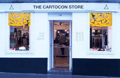
Cartocon Window Display - Sketchbooking

I've been doing a module on enterprise this semester which has got me thinking about how to promote myself. In that spirit I recently had a fortuitous meeting which has led to a pretty cool opportunity.

Cartocon is a new menswear and lifestyle shop on Nethergate which stocks several brands including its own label. I went in for a peek recently and got talking to one of the company directors, Shafeeq, and he mentioned that they were keen to do projects with local artists/students. This got me thinking about what I could offer them in terms of my own work.

All my fans will know that I did a window display for Urban Outfitters a couple of years ago which was an amazing chance to work with a big brand and gain some design skills. Urban Outfitters and Cartocon have a similar target customer so I thought the Cartocon guys might be interested in my work. I took the plunge and emailed Shafeeq with some photos of my work and a proposal to do a window display. Fortunately he was really keen on the idea so I've been discussing it with him and the Creative Director of Cartocon, Nathan, for the past few weeks.

Luckily for me they are both completely on board with the idea and have given me a lot of freedom. Their only stipulation was that the design should include their logo in some capacity and should only cover roughly the top third of the window. Cartocon's windows are a lot smaller than Urban Outfitters so should hopefully present much less of a technical challenge.


I started by thinking about the logo, looking for patterns in my surroundings and just getting some sketchbook pages filled.


I love the Crawford Building of DJCAD so I took some photos and started abstracting some of the shapes and forms of the building.


I also looked at the shapes of coat hangers with clothes on them that I'd photographed in the shop and played about with drawing and layering them.


Next stage was working up some designs which I will be posting soon! Really excited about taking this project through to completion.

Thursday, 17 March 2016

Artists' Book


My latest brief was to create either a 36-page children's book or an artists' book. I initially wanted to challenge myself with the children's book brief so started drawing stuff and doing some research.


I was feeling quite negative about the project and was struggling to come up with anything I felt enthusiastic about. After a talk from one of our tutors about his artists' books I decided to scrap what I had been working on and do a project I'd been thinking about for a while.

Last year I found lots of old wallpaper outside a house which is being renovated on Perth Road. There were several layers of paper which I thought was interesting firstly as whoever lived there hadn't even bothered to strip the paper each time they redecorated... And also it gives an insight into what the interior of the house looked over the years.


I went and did some drawings and took some photos of the house.


The house is directly opposite a church which got my mind running down some odd tangents. I started looking at Christian art and thinking about religious objects generally.


I love the look of religious art and some of the panels I was looking at had interesting angled tops which reminded me of the angles of the house and the church opposite. 


I decided that I wanted to create a triptych with the different layers of wallpaper as a sort of sequence. I thought it would be cool to use Orientated Strand Board to make the triptych as it's a material often associated with abandonment and dereliction which obviously ties in with the house. I also like OSB as a material as there's something very textural and almost colourful about it with the different chips of wood all being pressed together. The textures of the wallpaper go nicely with the OSB and both have a nice patination which reminds me of the feel of the old religious artworks I am referencing.


Going into the workshop is always a bit intimidating for me but I think I've conquered my fear with this project! I really enjoyed planning and making the triptych and managed to get a level of finish which really surprised me. Here'e a wee sneak preview:


I'll do a blog post with proper pictures once the project is resolved. 

I had been thinking about the triptych as a sort of personal altarpiece or shrine and was thinking about the idea of devotional objects. The triptych folds up to be pretty easily portable but I wanted to make a smaller concertina book as a sort of travel altarpiece which could accompany the triptych. 


I monoprinted the textures of the wallpaper and the OSB and combined them with the angular building shapes I'd been looking at in these double-sided screen-printed books. To emphasise the angular feel I went with an unconventional and uneven fold - but I experimented with it to make sure that the book could stand up by itself. 

I'm really enjoying this project and feel really enthused about it but I'm aware that my ideas for it might be a bit abstract or incomprehensible to the viewer... So I'm working on resolving it and have a few ideas which I think could be really cool. I'll blog my development and the completed work when it's done!

To round off here is a video of me flicking through my sketchbook by "In the Art School"; some fellow communication-designers who are doing a project "documenting the daily activities of students" in DJCAD. They've been posting lots of videos of me (amongst others) being goofy (mercifully shot in black and white) but this sketchbook one is my fave!

Wednesday, 2 March 2016

Growth and Form Prints

For my second self-initiated mini print project I decided to play about with screen printing bolder shapes than usual and using different materials to block the screen. Since last term I've been dipping in and out of D'Arcy Thompson's On Growth and Form, a textbook on mathematical biology which is a surprisingly good read, I promise... Anyway there are some really interesting points of inspiration about design in nature which I picked up on and decided to make some prints relating to structure in leaves so I poached a couple from a bush on campus, sourced a piece of netting from a satsuma box, and played about with some monoprints:


I love the simple almost photographic tonal quality of these prints and decided to incorporate the monoprint method into my final screen prints.